The Main Idea: Connecting the Kitchen
Some remodels change the look of a space. This one reshaped it at it’s core. When our homeowners came to us, they had a clear vision: a kitchen that felt open, functional, and full of personality, and a home whose main living area finally meshed instead of competing for space. Our team took the kitchen down to the studs and rebuilt it from the ground up, managing the design, demolition, carpentry, and finishing from start to finish. The result is a bright, connected, and beautifully crafted space that feels like home.
The Challenge: A Kitchen That Worked Against Its Owners
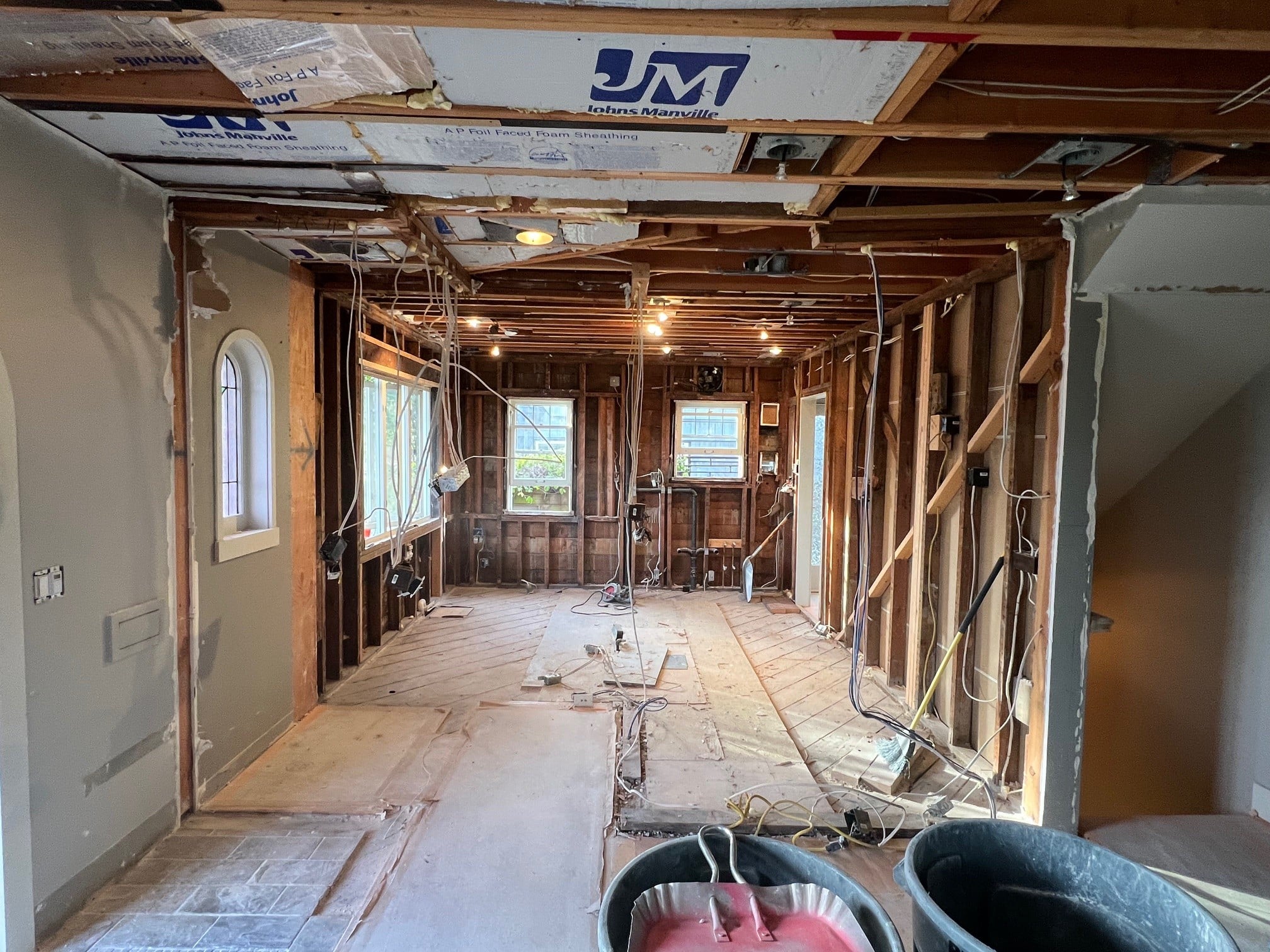
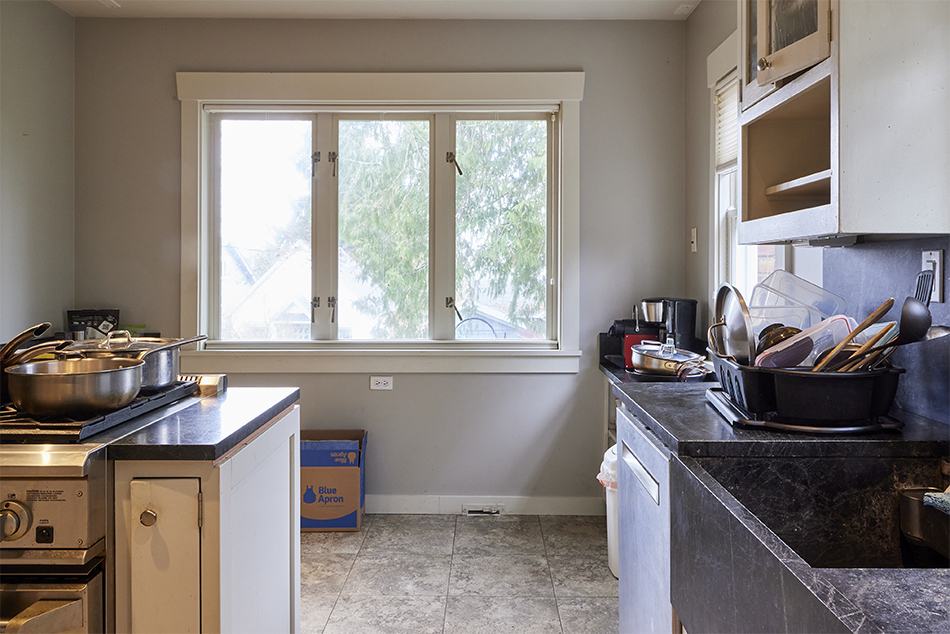
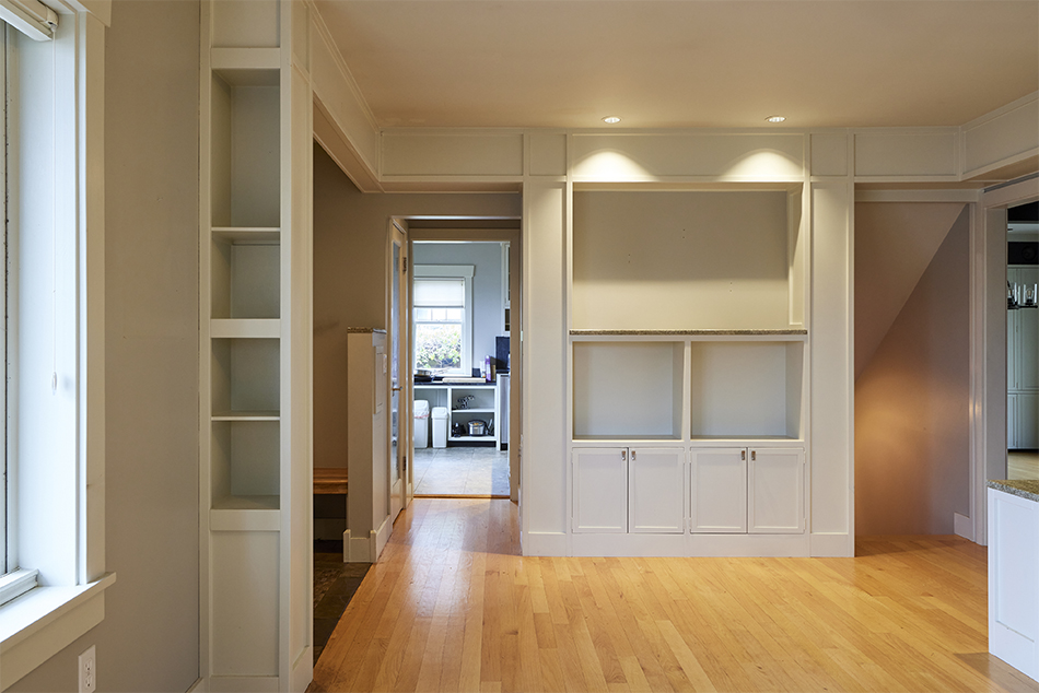
The original kitchen was cramped and awkwardly arranged. Its unconventional layout placed a peninsula directly in the middle of the room, which chopped up the floor plan and left little room to move. The refrigerator had been pushed into a tight corner, making everyday tasks like unloading groceries or prepping a meal more difficult than they should be. A wall lined with built-ins separated the kitchen from the adjacent living room, closing the space off and trapping both rooms in separate, dim compartments. A closet sat nearby, taking up valuable square footage and complicating the flow of the entryway.
Nothing about the layout invited people in. It was a kitchen built for a different era, and the homeowners were ready for something that matched the way they actually live.
The Solution: A Layout Built Around Flow
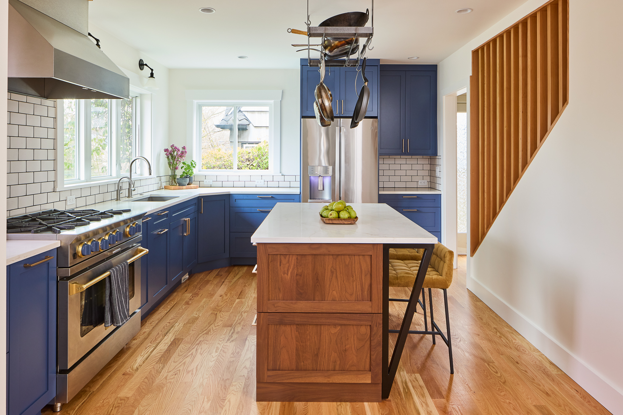
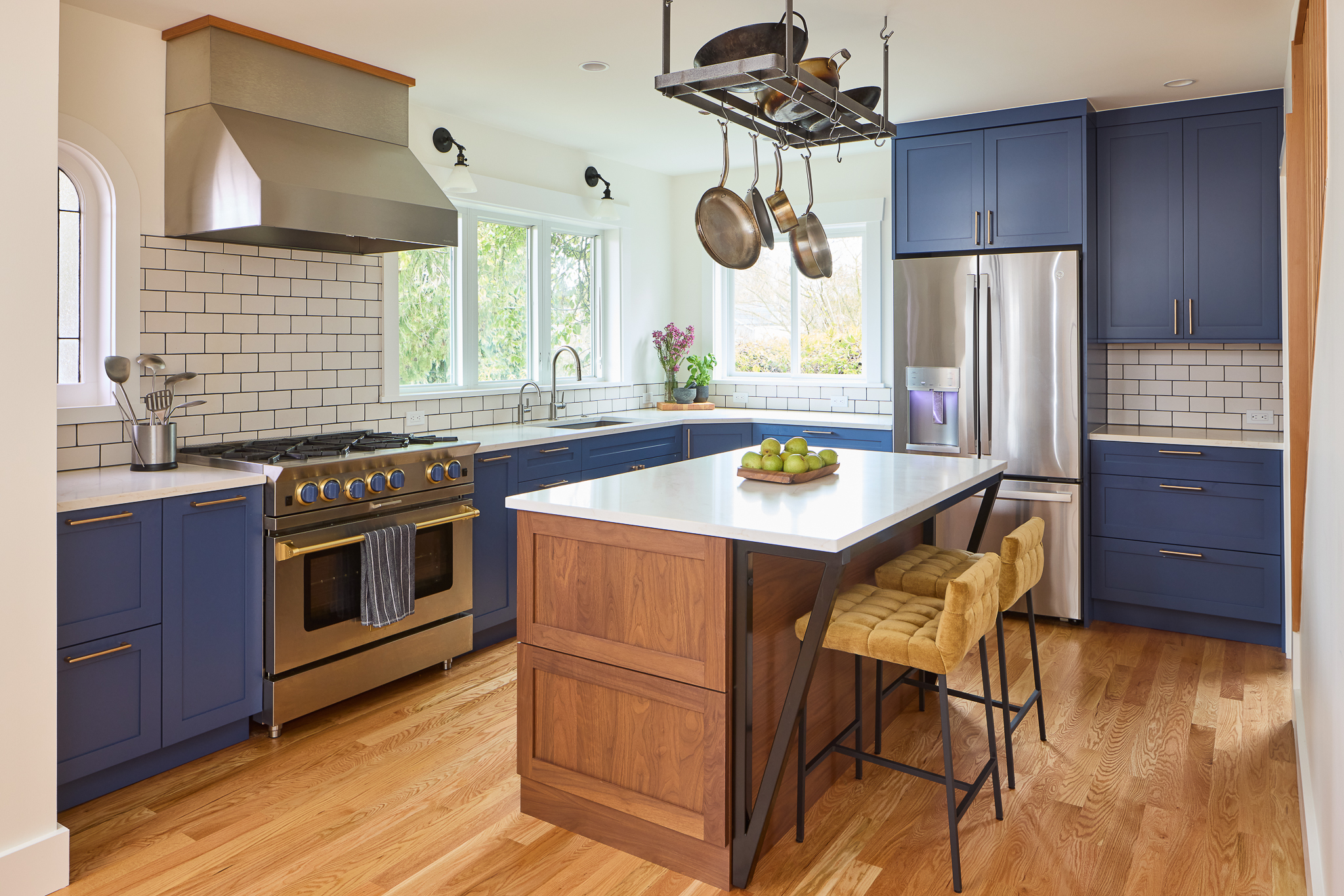
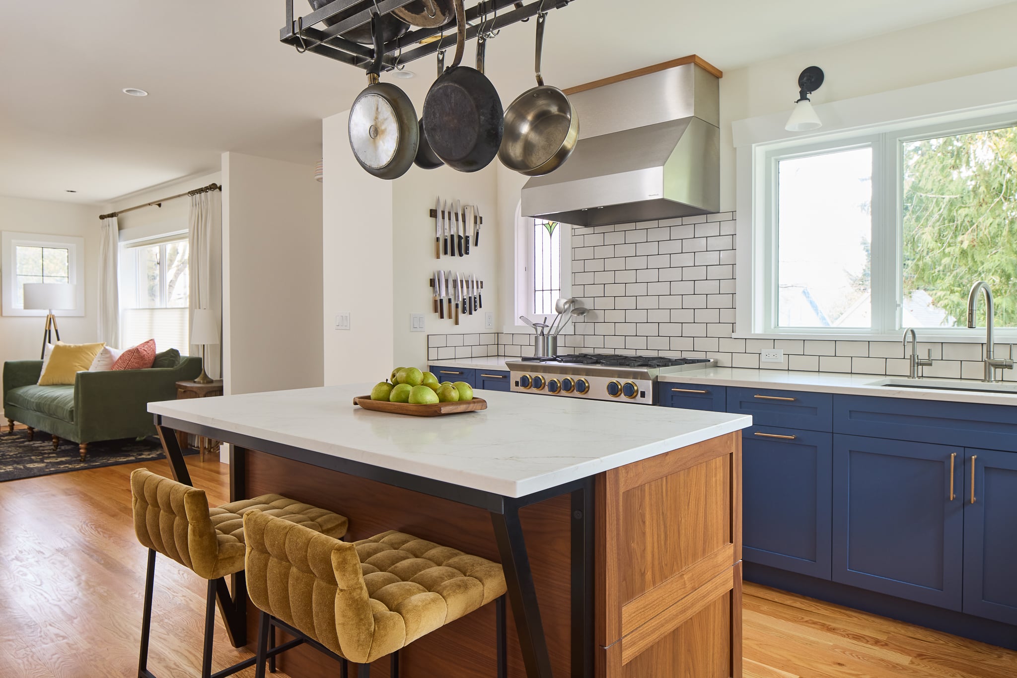
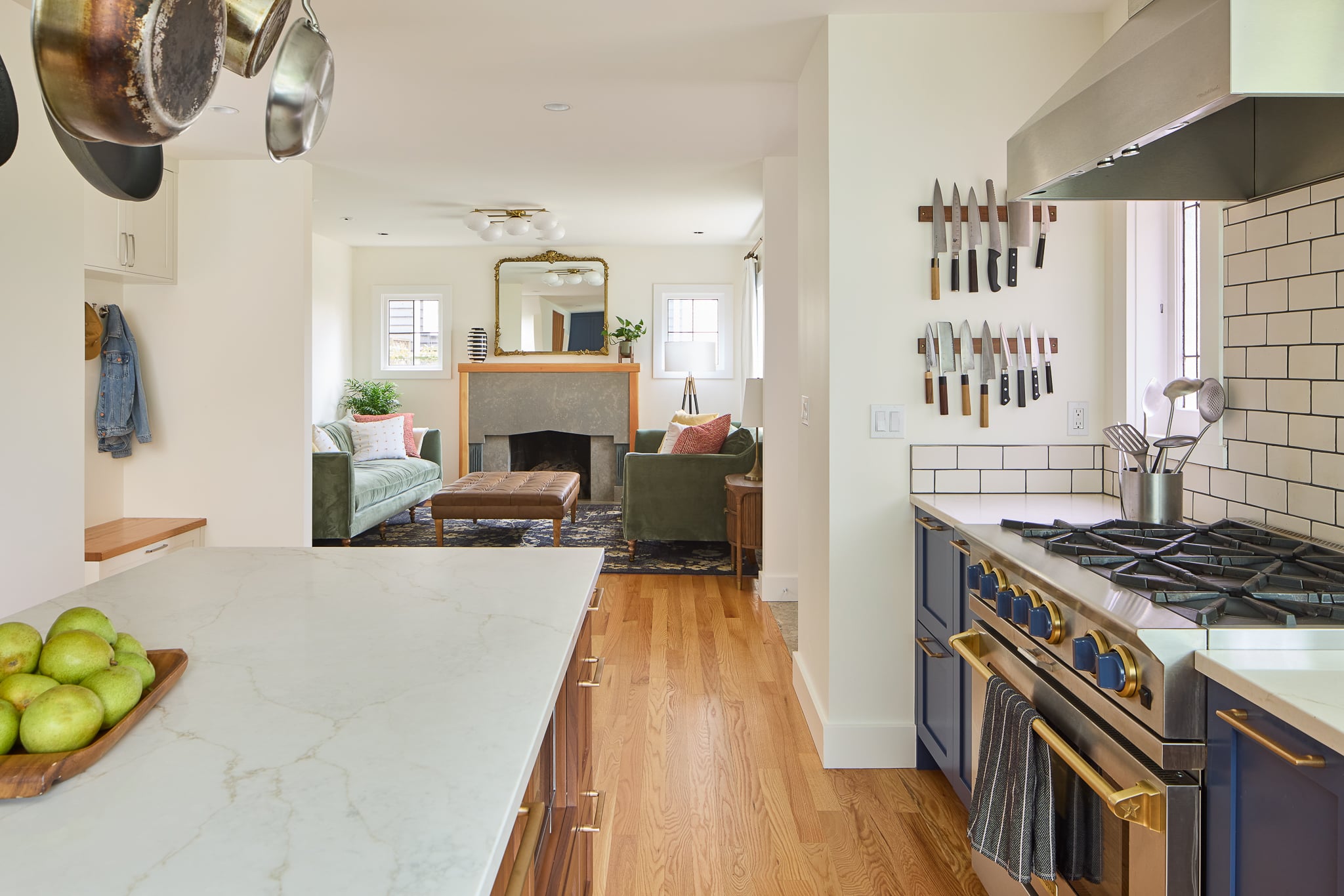
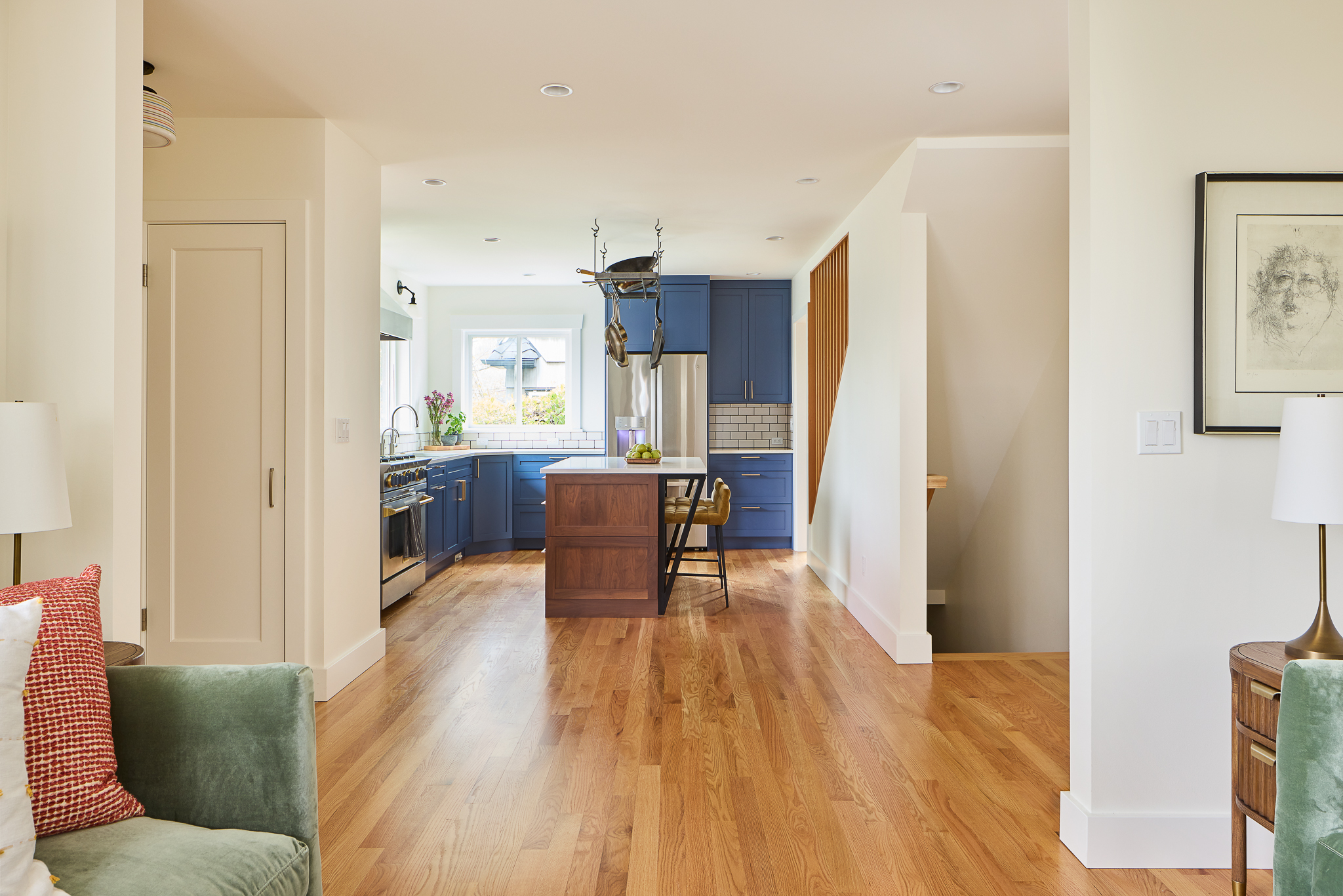
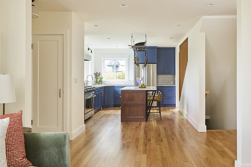
The transformation began with a bold structural decision: removing the wall and built-ins between the kitchen and living room. With that single change, two separate rooms became one connected, welcoming space. Natural light now travels freely through the main level, and conversation can carry from the stove to the sofa.
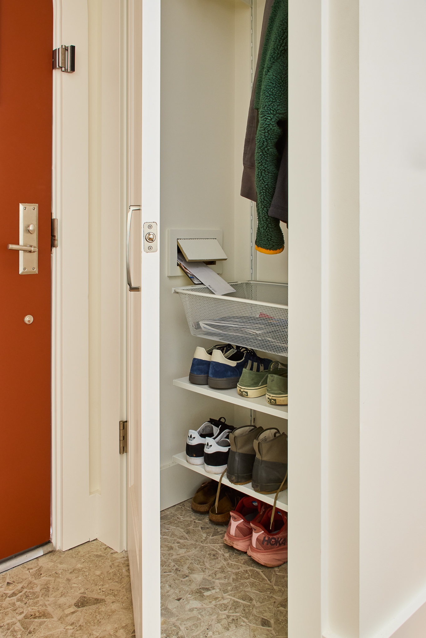
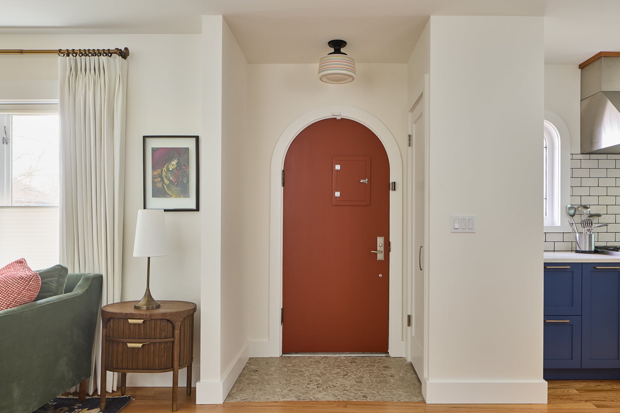
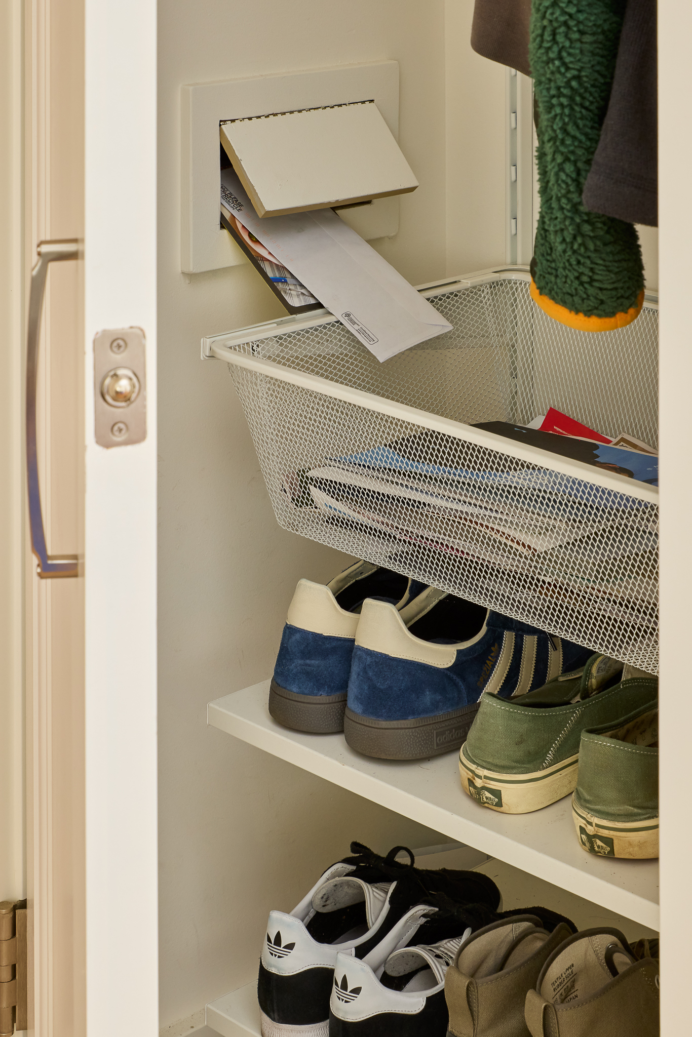
We also relocated the closet that had been consuming prime floor space. In doing so, we redesigned the entryway, creating a more intentional and functional arrival point rather than a leftover corner. Moving the closet gave the kitchen room to breathe and allowed the whole floor plan to be reconsidered.
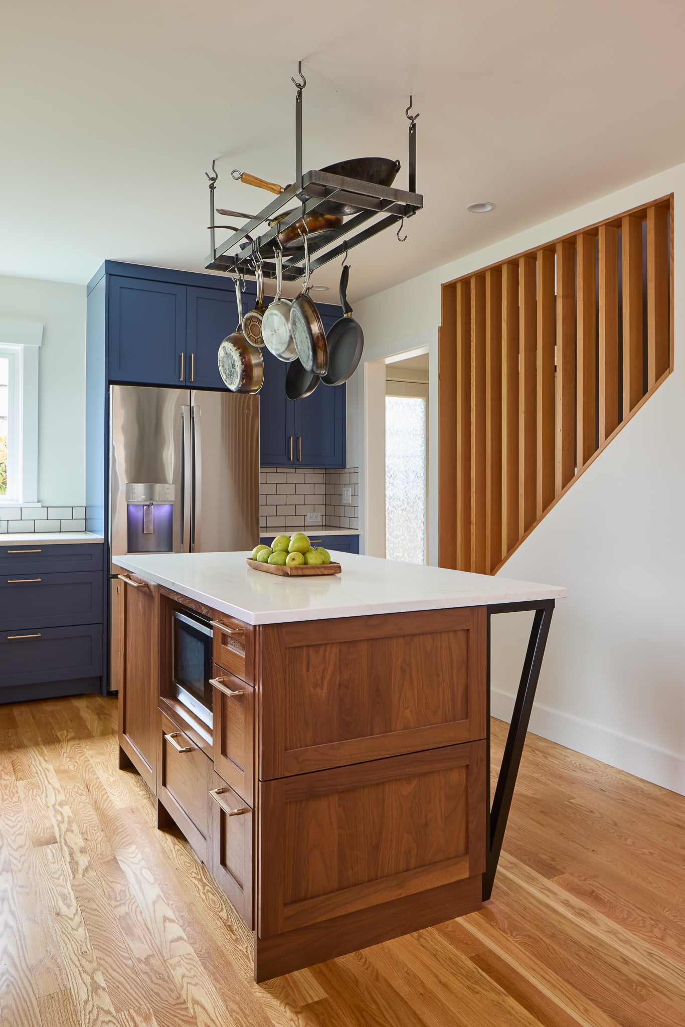
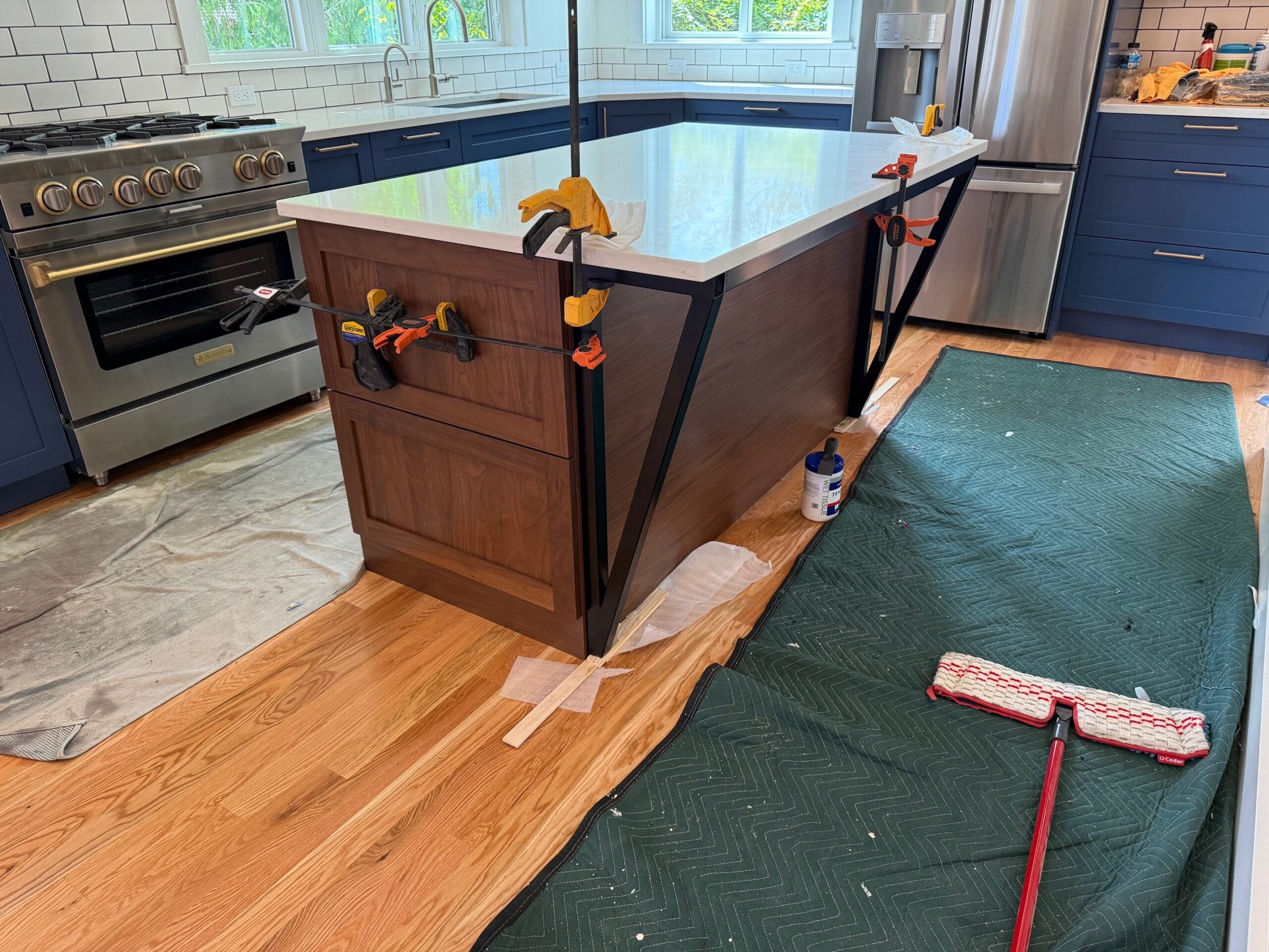
The old peninsula was replaced with a freestanding kitchen island featuring two bar seats. Where the peninsula had fought the room, the island balances it. Traffic now moves around the island naturally, the refrigerator has a proper, accessible home, and the cook can stay engaged with family and guests rather than being tucked away. The two bar seats provide a casual spot for morning coffee, homework, or a glass of wine while dinner comes together.
BEFORE & AFTER
Rich Color, Crisp Contrast
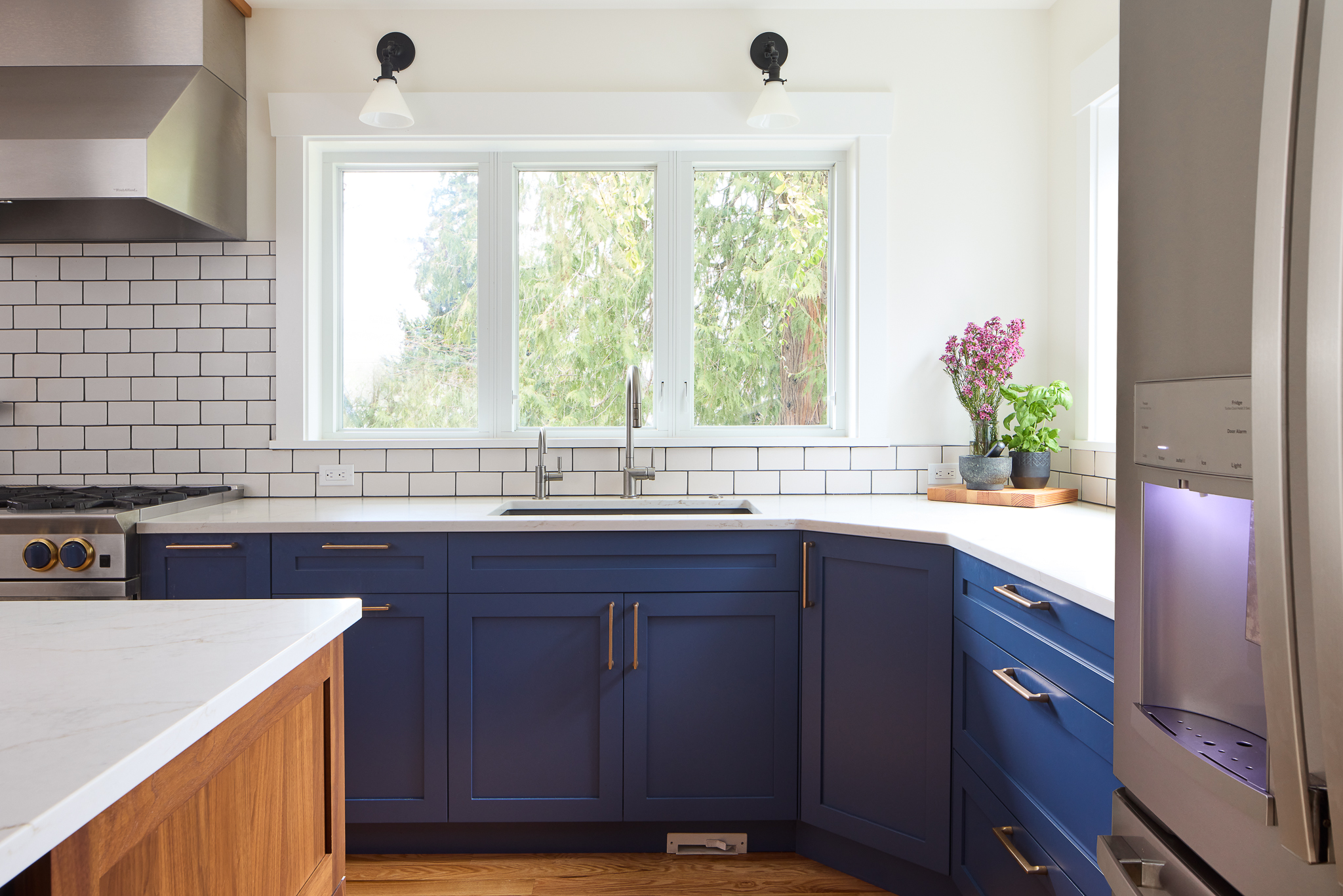
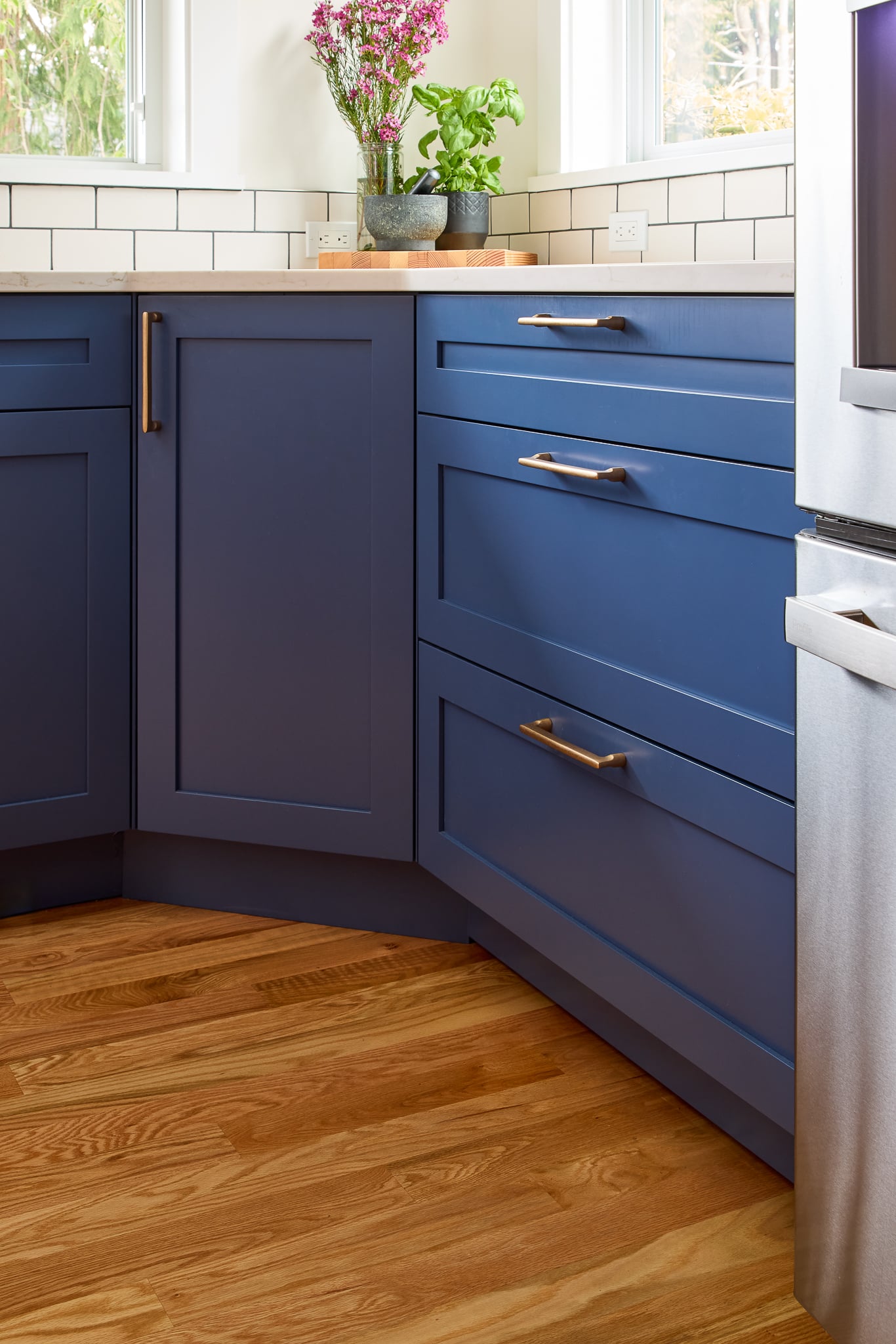
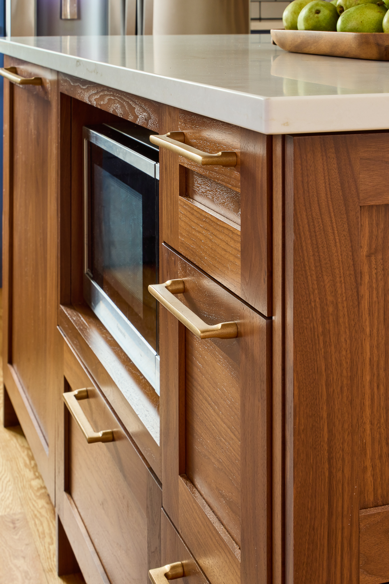
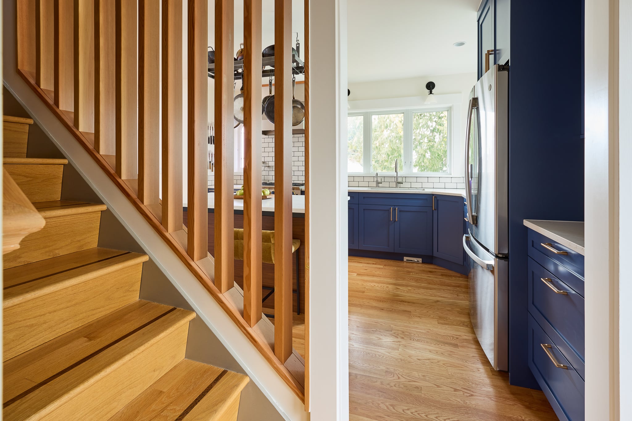
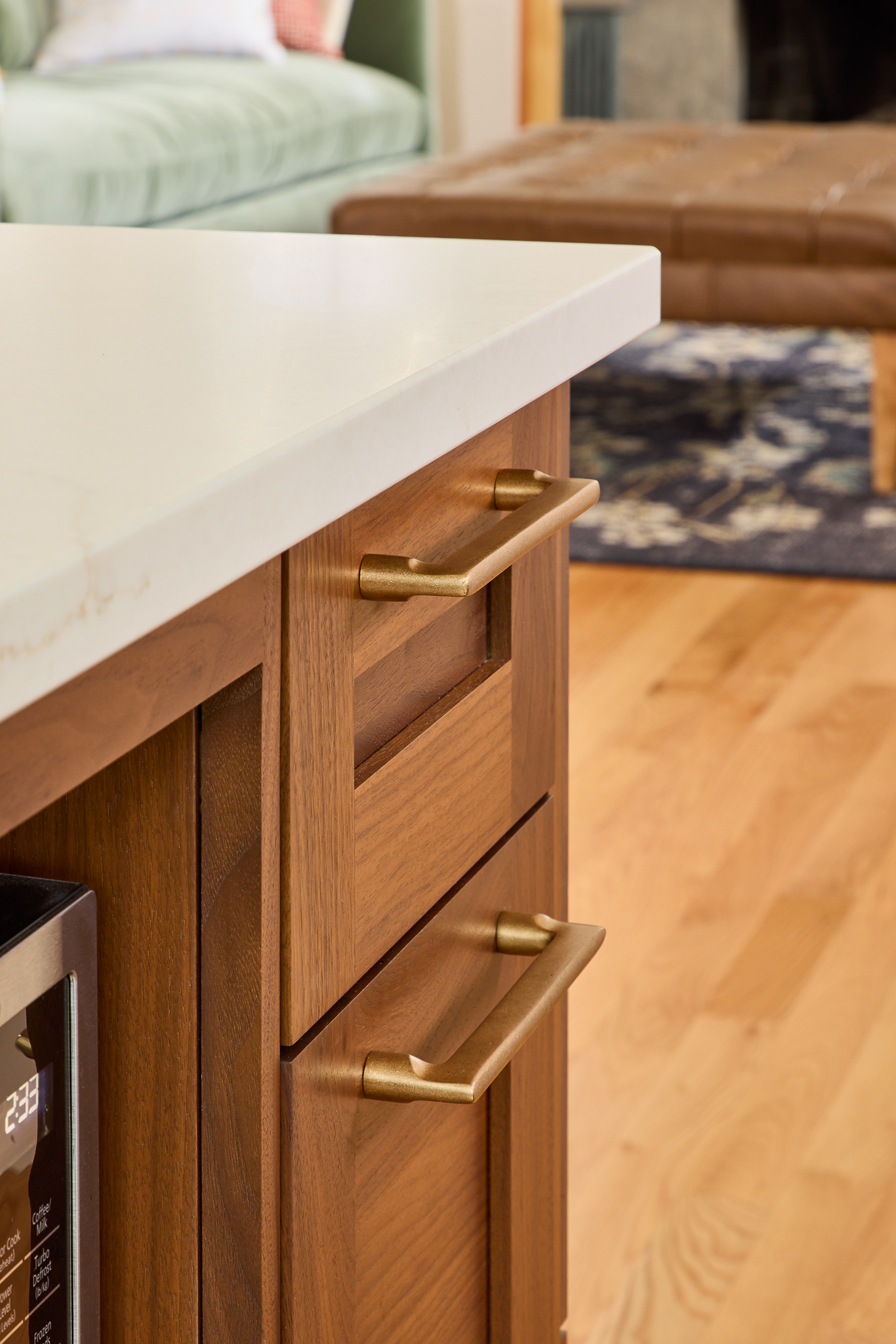
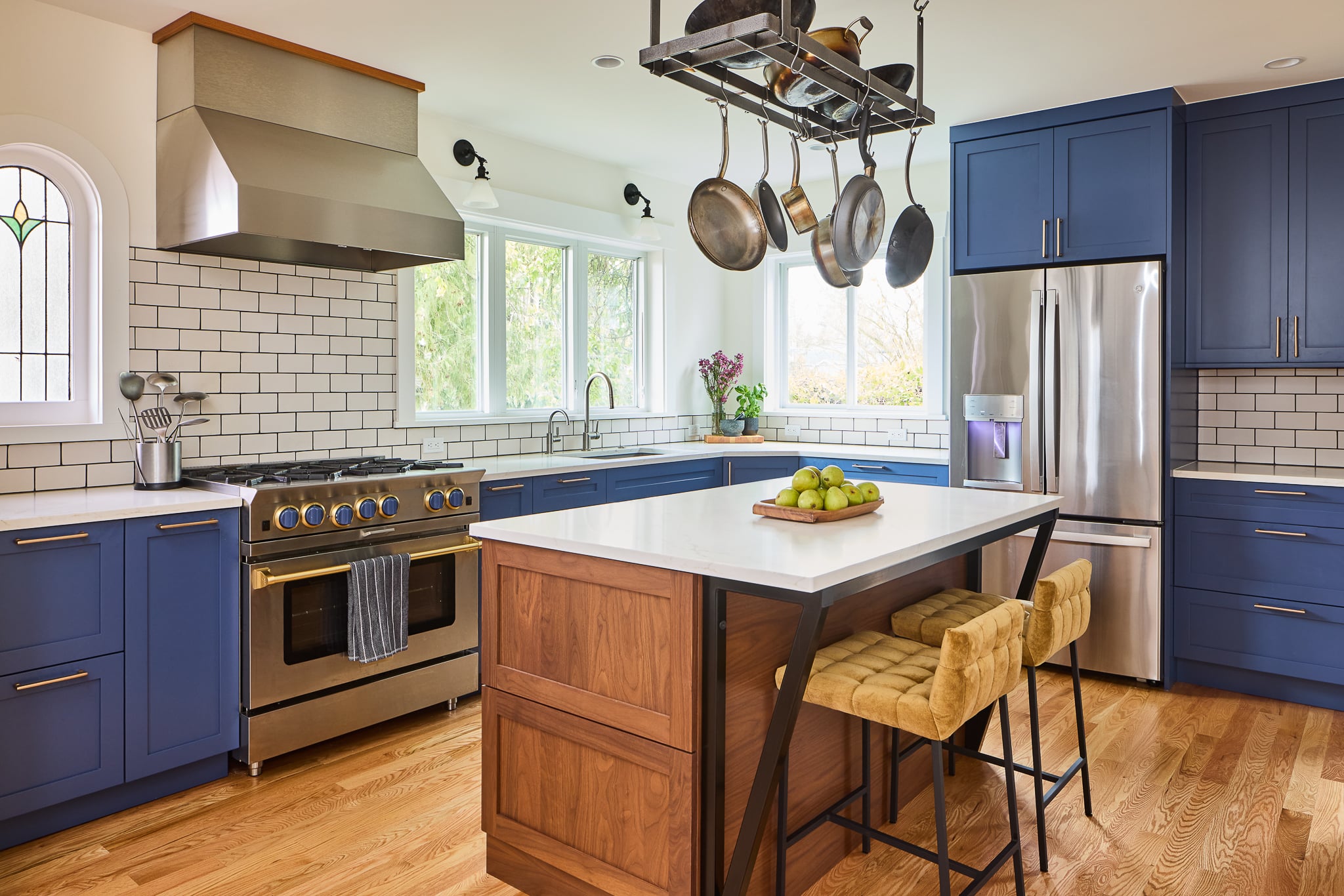
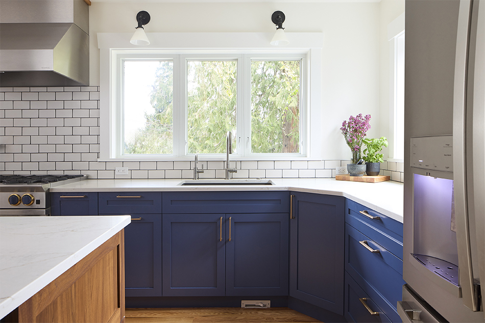
The new kitchen is a study in confident, classic design. The cabinetry is painted a rich, deep blue that anchors the room and gives it warmth and depth. It is bold without being overwhelming, and it pairs beautifully with the other finishes throughout the space such as walnut and bright quartz.
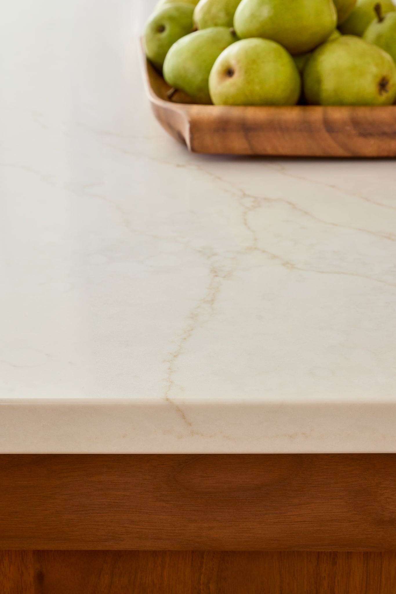
Polished quartz countertops provide a durable, low-maintenance work surface with a clean, elegant sheen. Quartz is ideal for a busy household: it resists stains and scratches and holds up to daily use while looking refined.
The wrap-around backsplash is one of the kitchen’s understated features. White subway tile laid against dark gray grout creates a high-contrast, graphic look that draws the eye and defines the perimeter of the room. The classic tile shape keeps the design timeless, while the grout lines add a crisp, tailored quality. Together with the blue cabinetry, the backsplash gives the kitchen a polished, balanced palette.
Gorgeous new stainless steel appliances complete the look, offering modern performance and a sleek, professional feel that complements the cabinetry and tile.
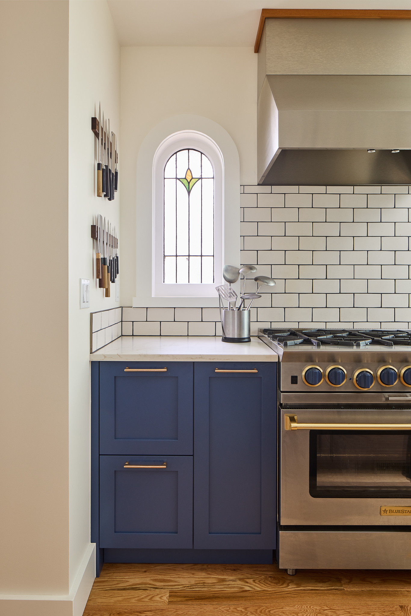
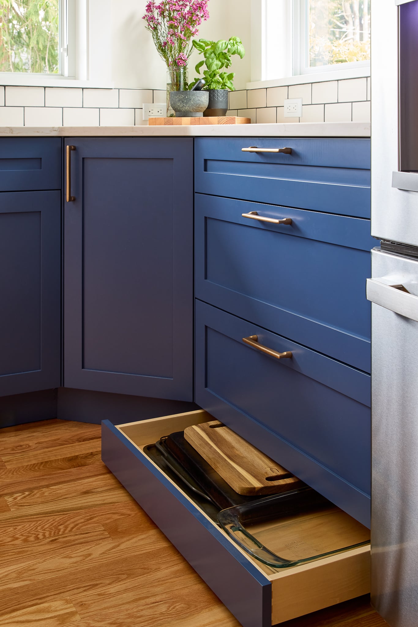
Good design is as much about what you can’t see as what you can. To keep the kitchen uncluttered, we incorporated storage solutions that are both practical and attractive. A hanging pot rack above the island keeps cookware within easy reach while adding a bit of visual interest overhead. A magnetic knife rack keeps bulky items off the counters and out of drawers, putting tools where they’re needed in a clean, well-organized way. These details keep the workspace open and efficient, so the beauty of the room isn’t buried under everyday clutter.
Opening the Stairway: Slats, Light, and Warmth
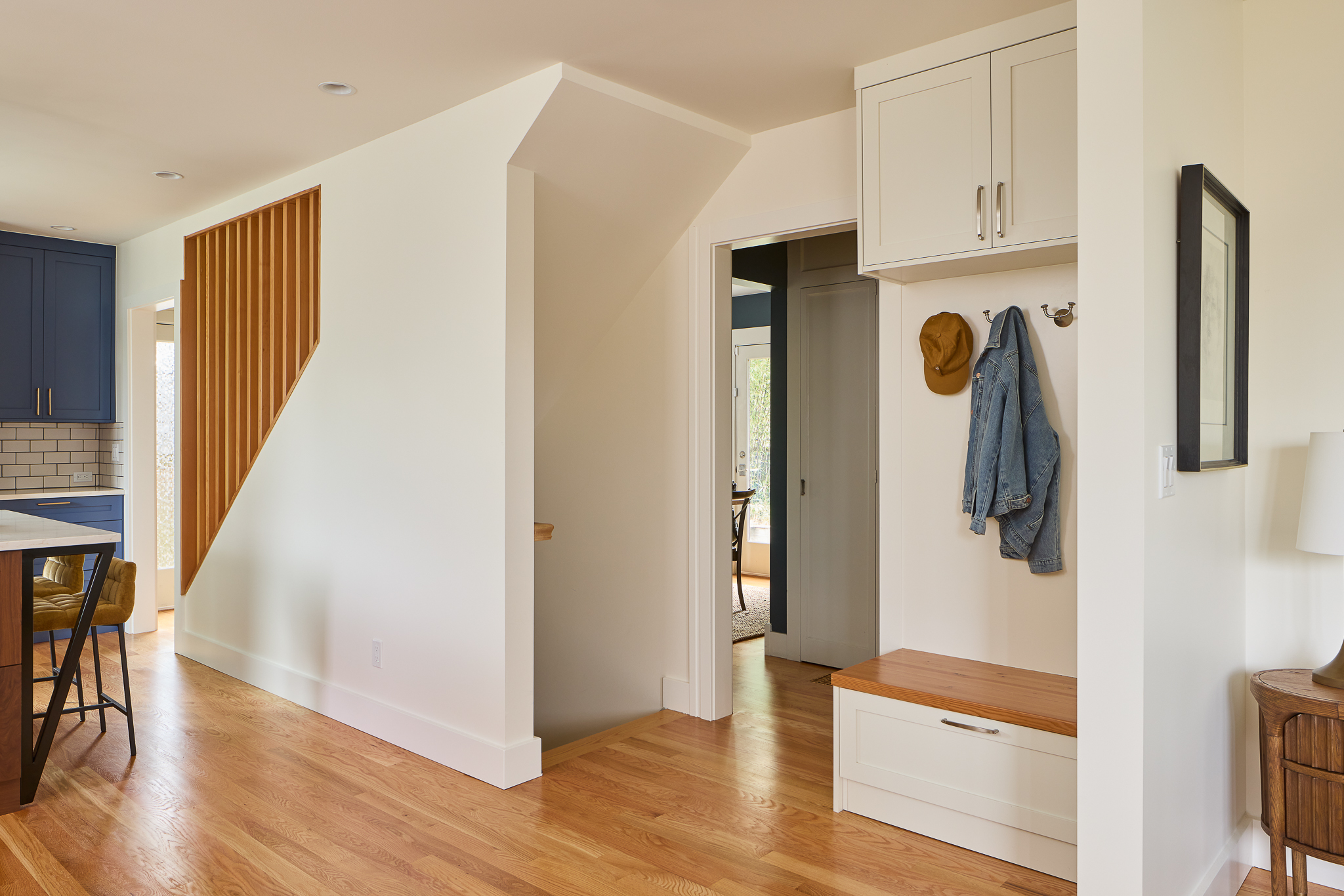
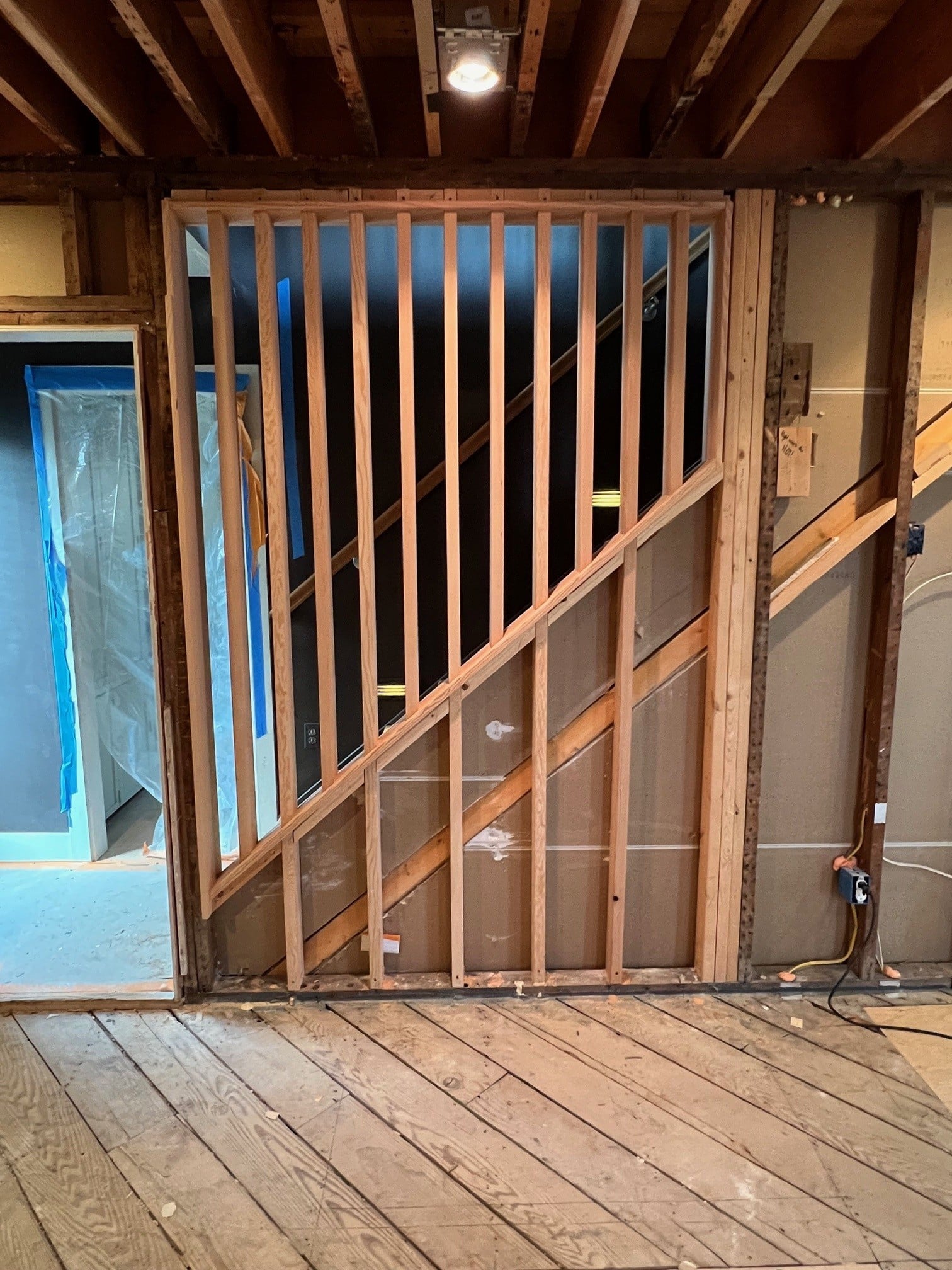
Removing the wall between the kitchen and living room had a wonderful secondary benefit: the stairway was suddenly able to be more open. We took full advantage of the opportunity by building a custom wooden slat wall along the wall bordering the stairs. The slats allow light to filter through, making the stairway feel brighter, airier, and more connected to the rest of the home. The wood textures also bring a warm, organic note that softens the room and contrasts nicely with the cool blue of the cabinetry.
Directly across from the stairway, we added new built-ins that include a lovely wooden bench. It’s a functional, welcoming spot to sit, put on shoes, or simply pause, and it makes the entry and stairway area feel finished and intentional. Because we built these features custom, they fit the space precisely and reflect the same craftsmanship found throughout the project.
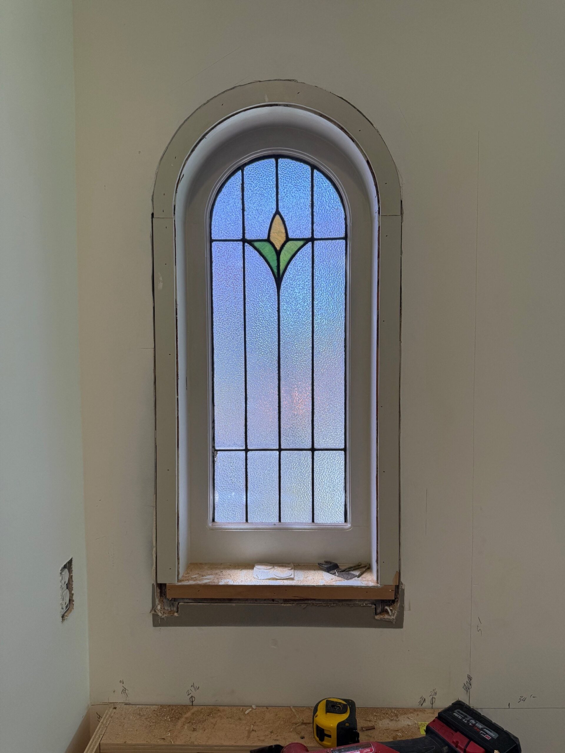
One of the most delightful discoveries of this project was a custom stained-glass arch window that had been hidden away inside a closet. It was a beautiful piece of craftsmanship that no one could appreciate. Once the closet was relocated, the window was finally free to take its rightful place as a feature of the kitchen. Now, it adds character, color, and a sense of history to the room, catching the light and giving the space a one-of-a-kind personality that no showroom design could replicate. It is a perfect example of how thoughtful remodeling can uncover what a home already had to offer.
The Living Room: Less Bulk, More Balance
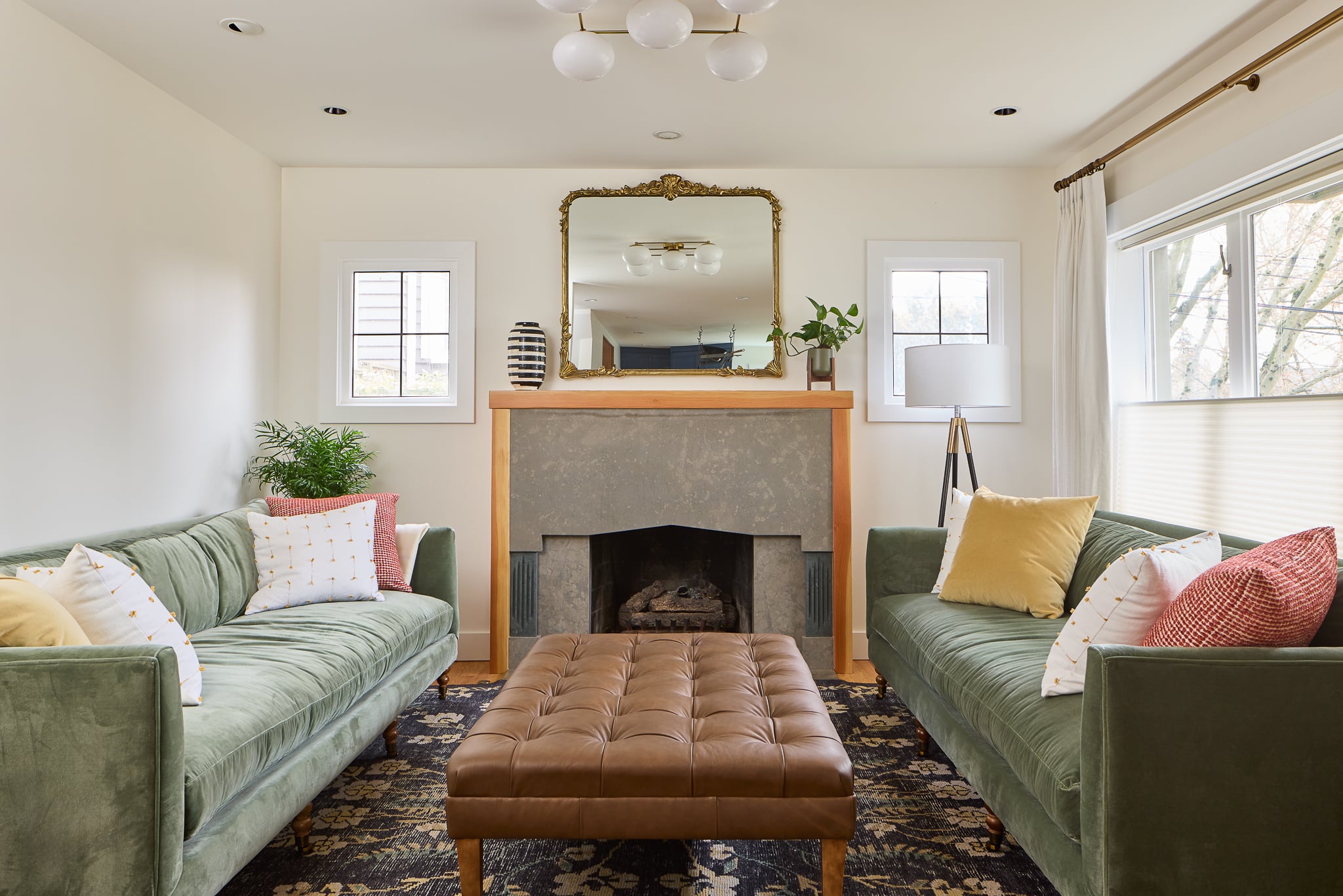
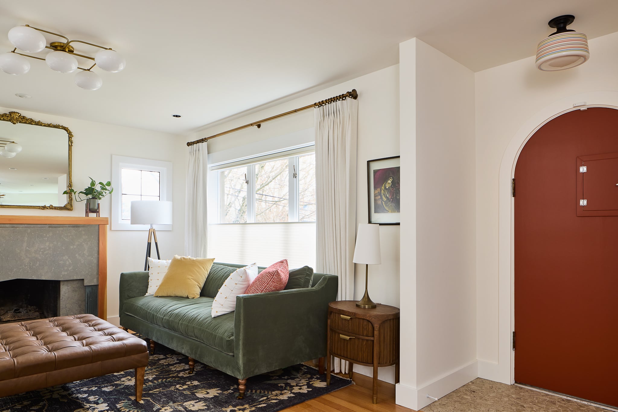
Our work didn’t stop at the kitchen. In the adjacent living room, we removed the bulky built-ins that had surrounded the fireplace. Taking them out freed up extra floor space and lightened the visual weight of the room, allowing the fireplace to feel like a purposeful focal point rather than something crowded by its surroundings.
To finish the area, we installed a new wooden mantle. The warm wood ties in with the slat wall and bench, creating design cohesion between the living room, stairway, and kitchen. Though a modest addition, the mantle helps the whole main level read as one thoughtfully planned space.
Moving Back In
What was once a cramped, closed-off kitchen is now an open, inviting space that supports the way the homeowners live, cook, and entertain. The relocated closet, the removed wall, and the new island transformed the layout. The new kitchen’s blue cabinetry, quartz counters, and contrasting tile give the room a timeless, personal style. And the custom woodwork, stained-glass window, and refreshed living room tie everything together into a home that feels cohesive from the entryway to the fireplace.
This project reflects what our team does best: listening closely to a homeowner’s vision, solving layout problems at the root, and building every detail with care. From demolition to the final finishing touches, we’re proud to have brought this vision to life.