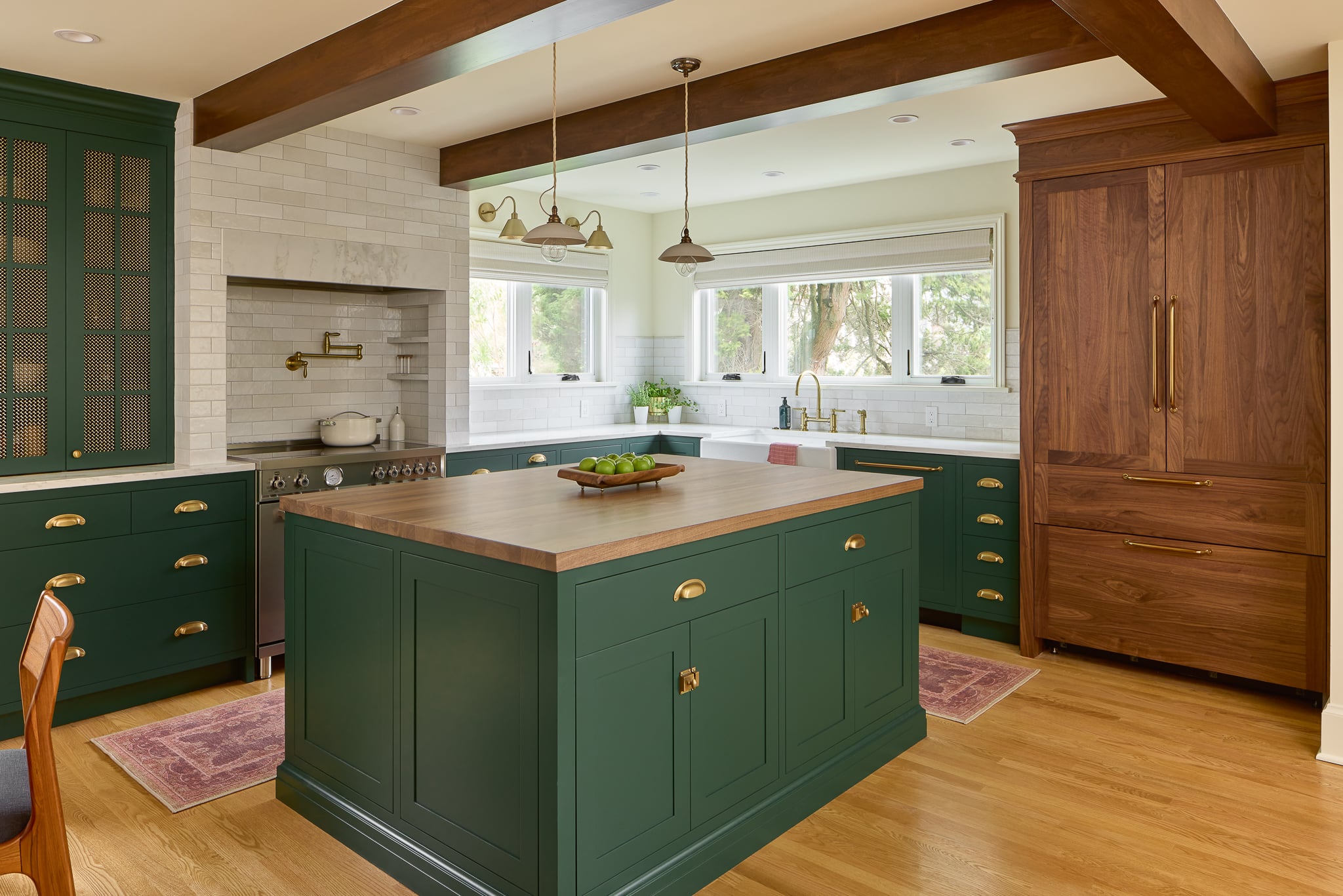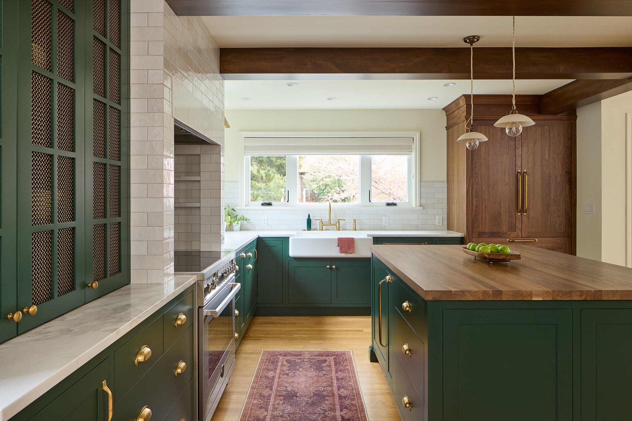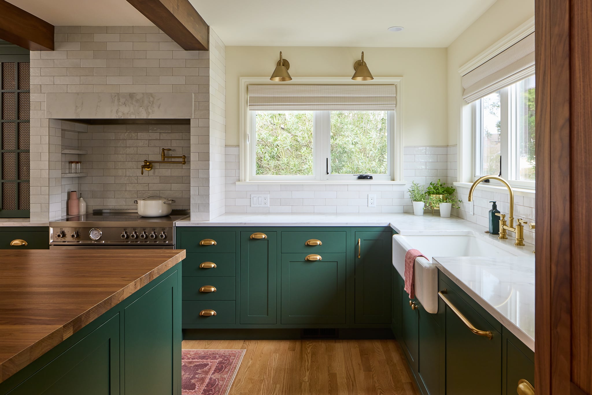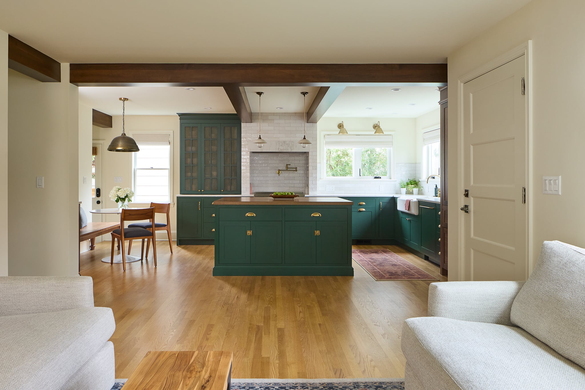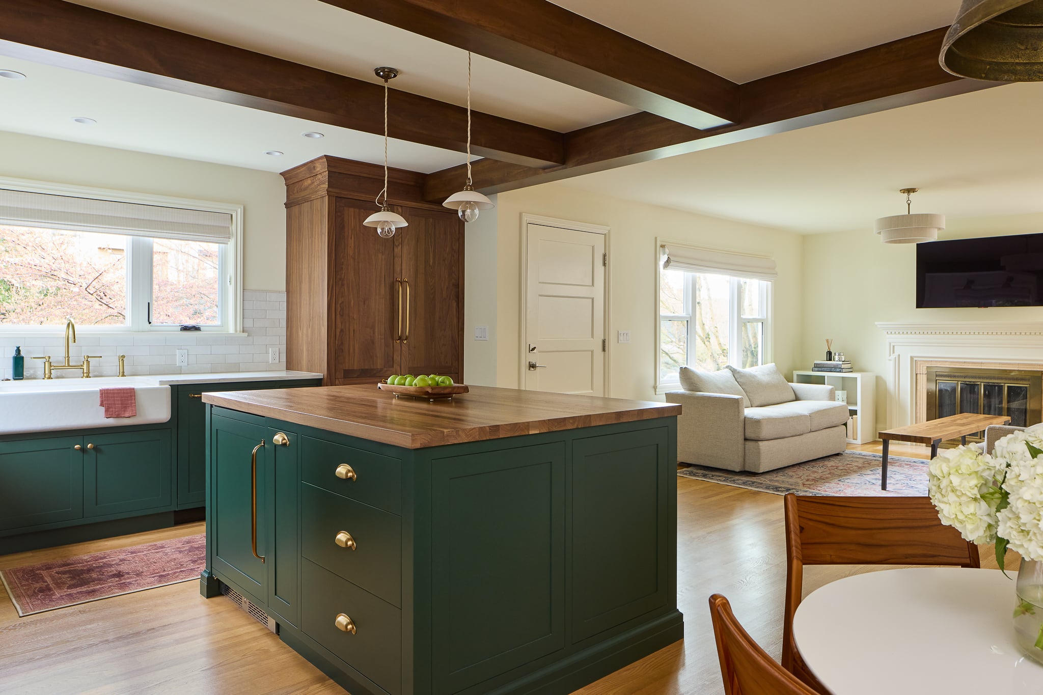
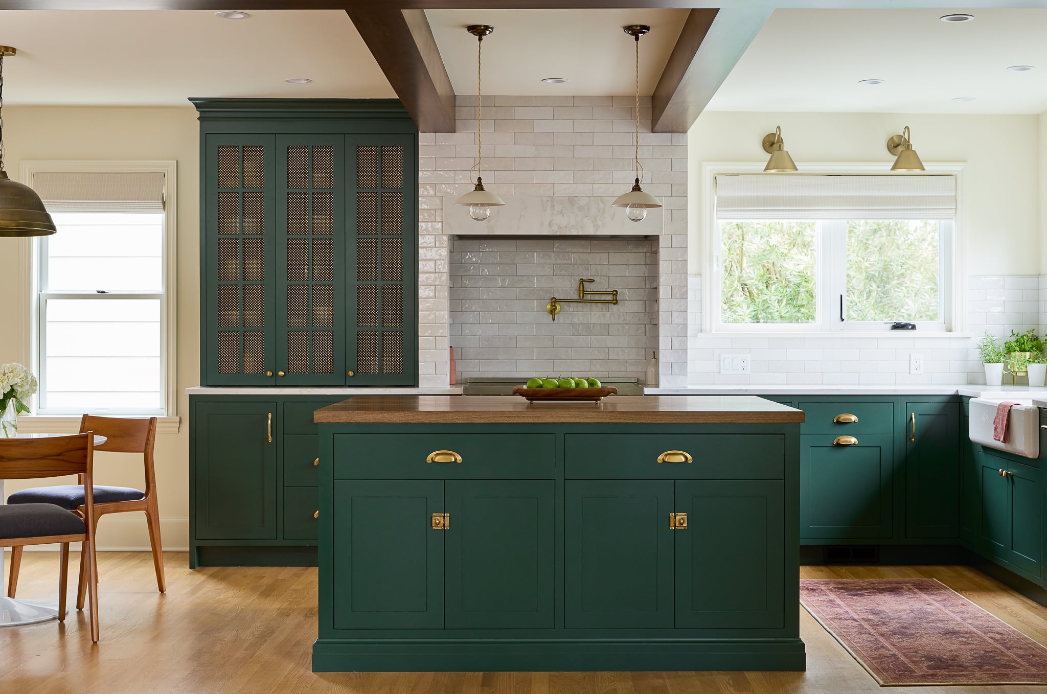
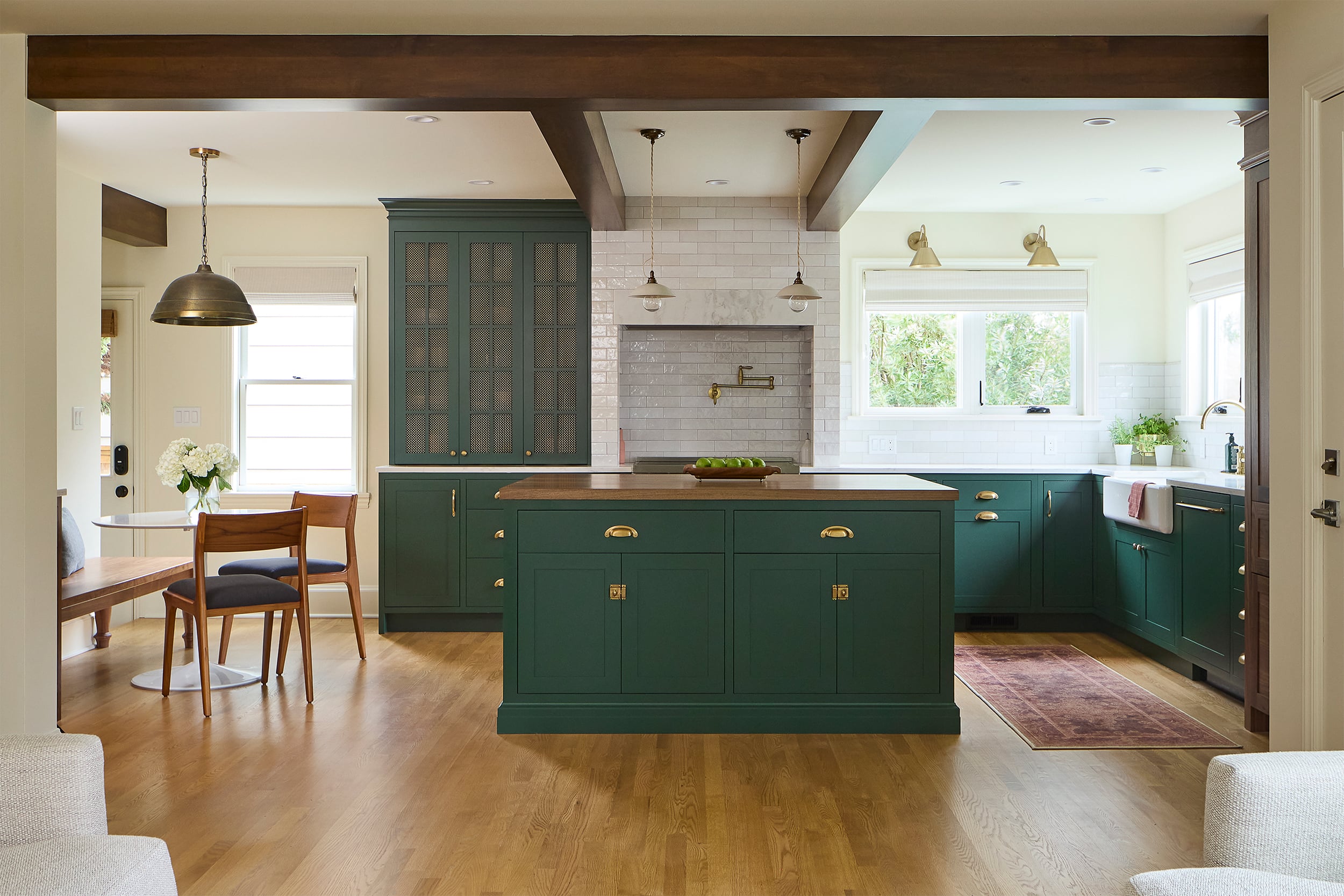
When this 1942 Ballard home came to us, the kitchen was a small room tucked into the back corner of the main floor. After working through the homeowner’s vision for their dream kitchen, our design team turned it into the open, light-filled space this home always neede. Walls came down, windows moved, and the new kitchen was fully opened to the living room. Dark walnut, deep Hunter green, brushed brass, and glossy white tile now give the home a kitchen that feels warm and classic, and a good fit for the house’s classic aesthetic.
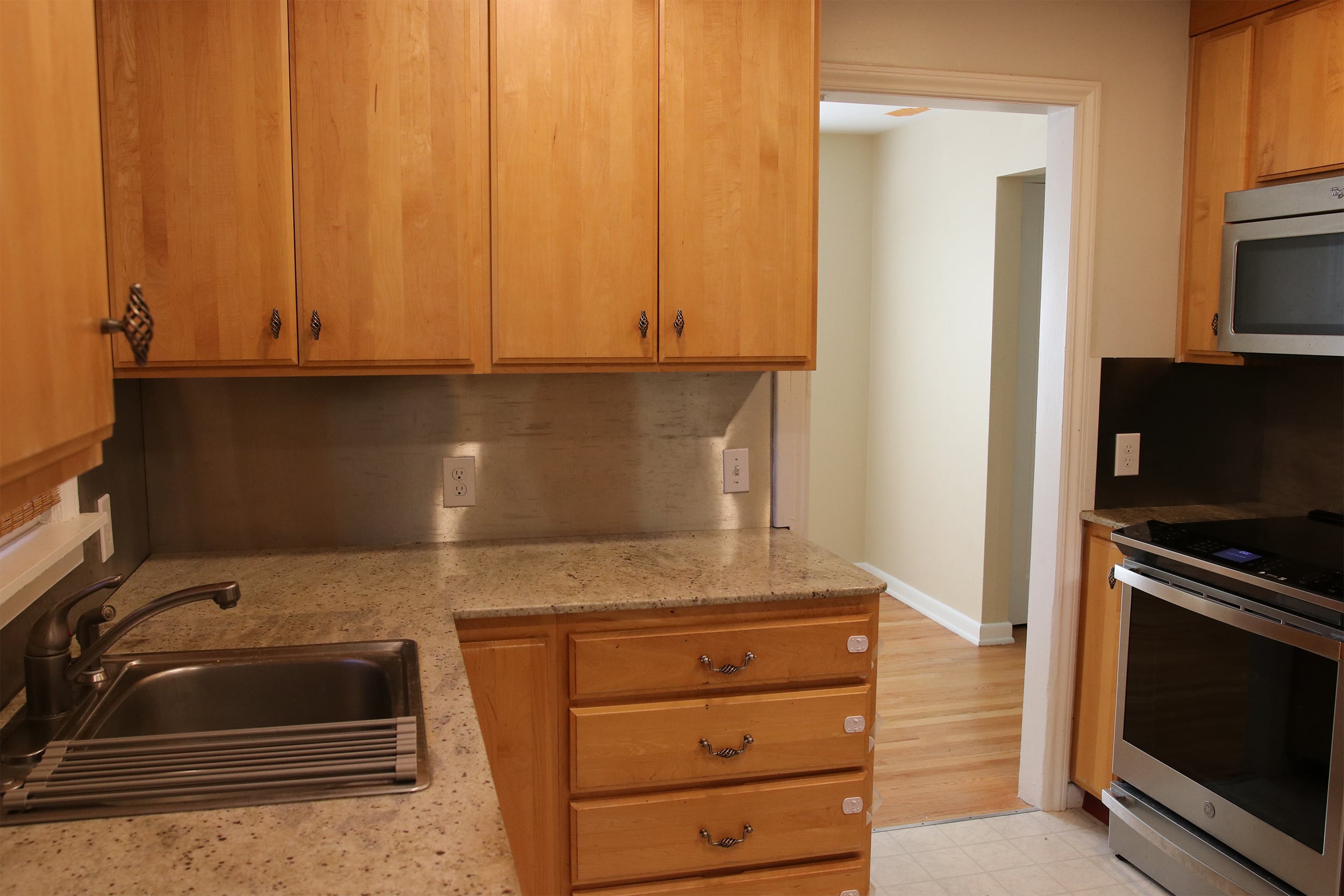
The Kitchen Before
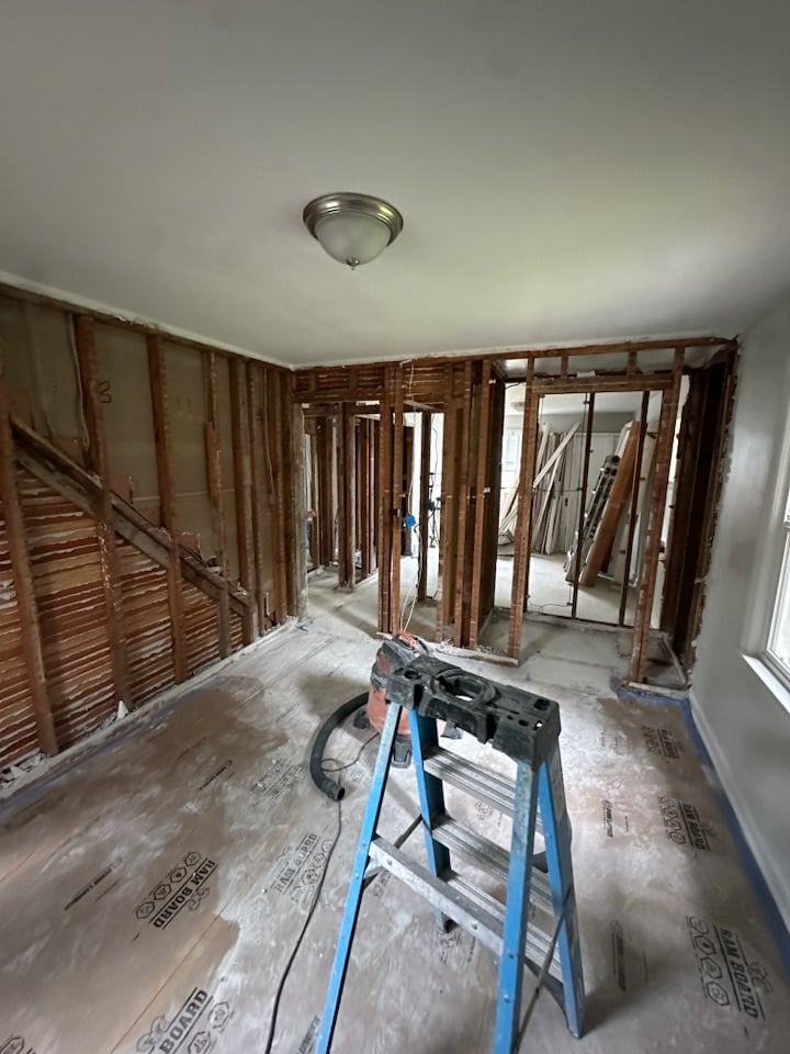
The original kitchen was a compact, enclosed room of roughly 100 square feet, walled off from both the dining room and the living room. It held the basics of a mid-century kitchen: a limited run of cabinets, minimal counter space, and one cook at a time. Entertaining meant guests clustered in a doorway or hovered in a hallway while the cook stayed shut in the back of the house.
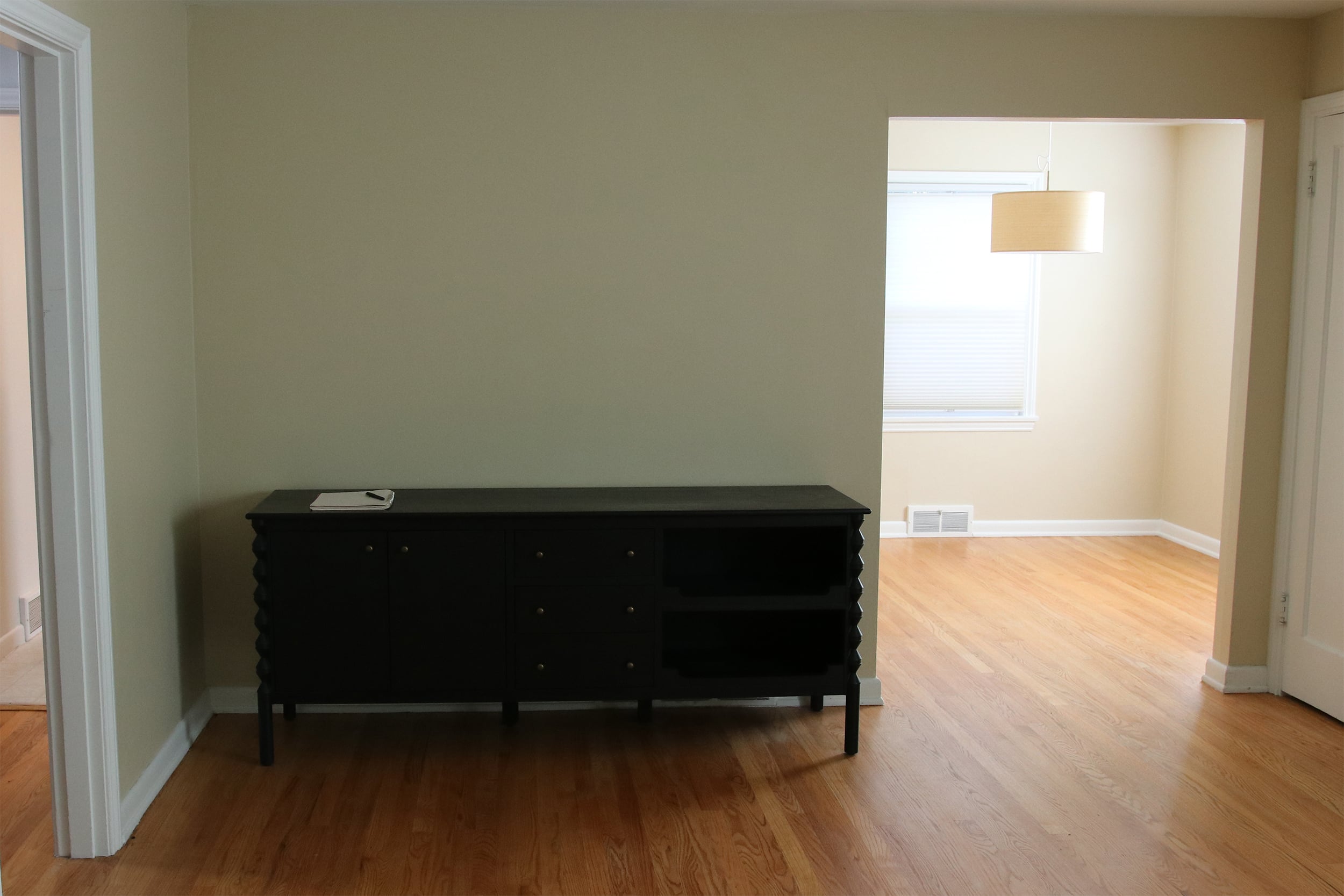
The floor plan around it added to the problem. The dining room sat on the other side of a wall from the kitchen, giving this home the standard midcentury separation of areas. The living room, the largest and brightest room in the house, felt disconnected from everything happening behind it. The kitchen had no island, no real prep surface, and no place for the family to gather.
Rethinking the Floor Plan
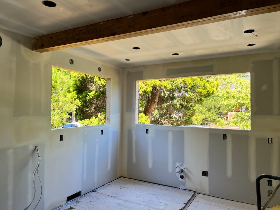
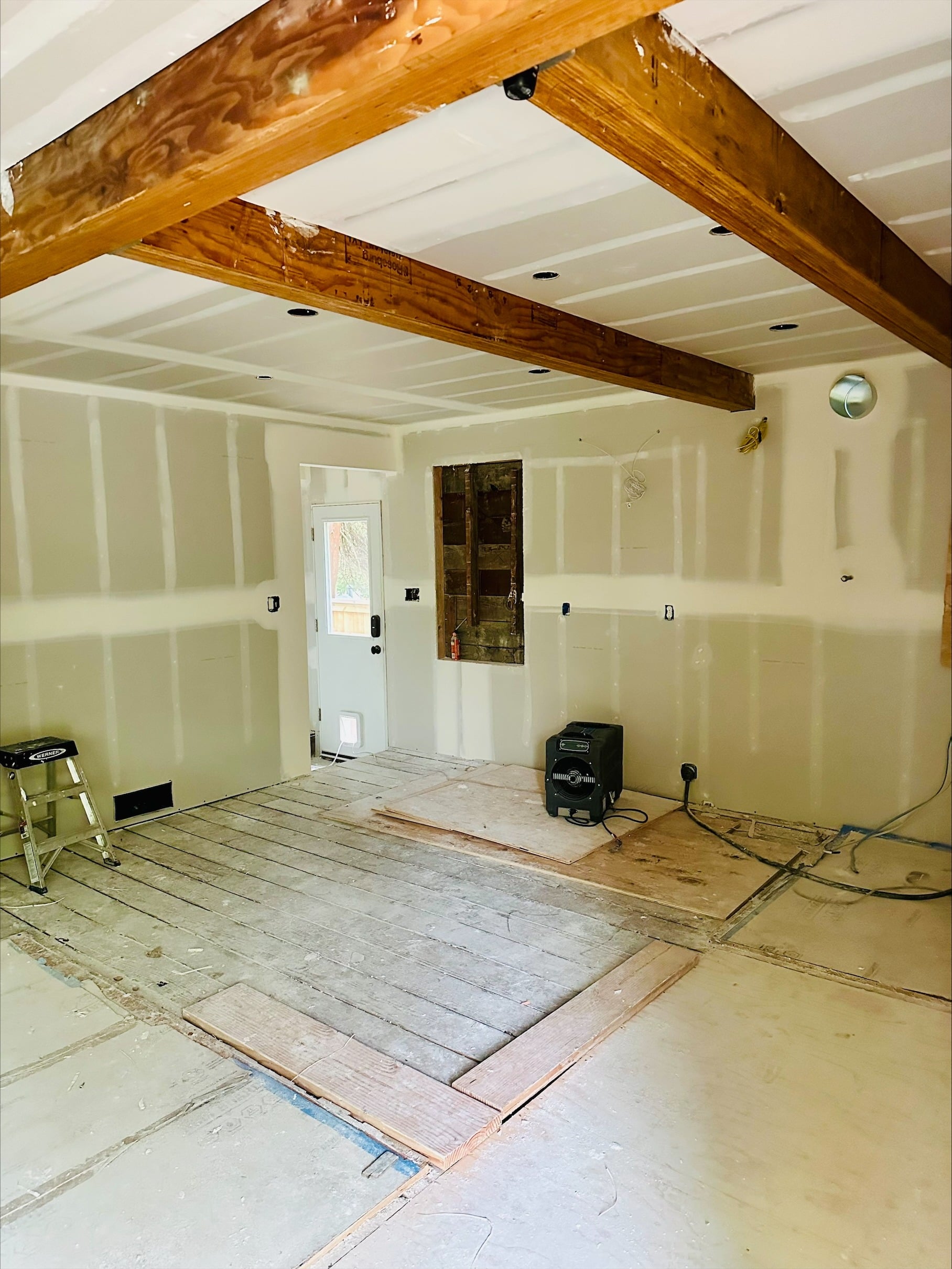
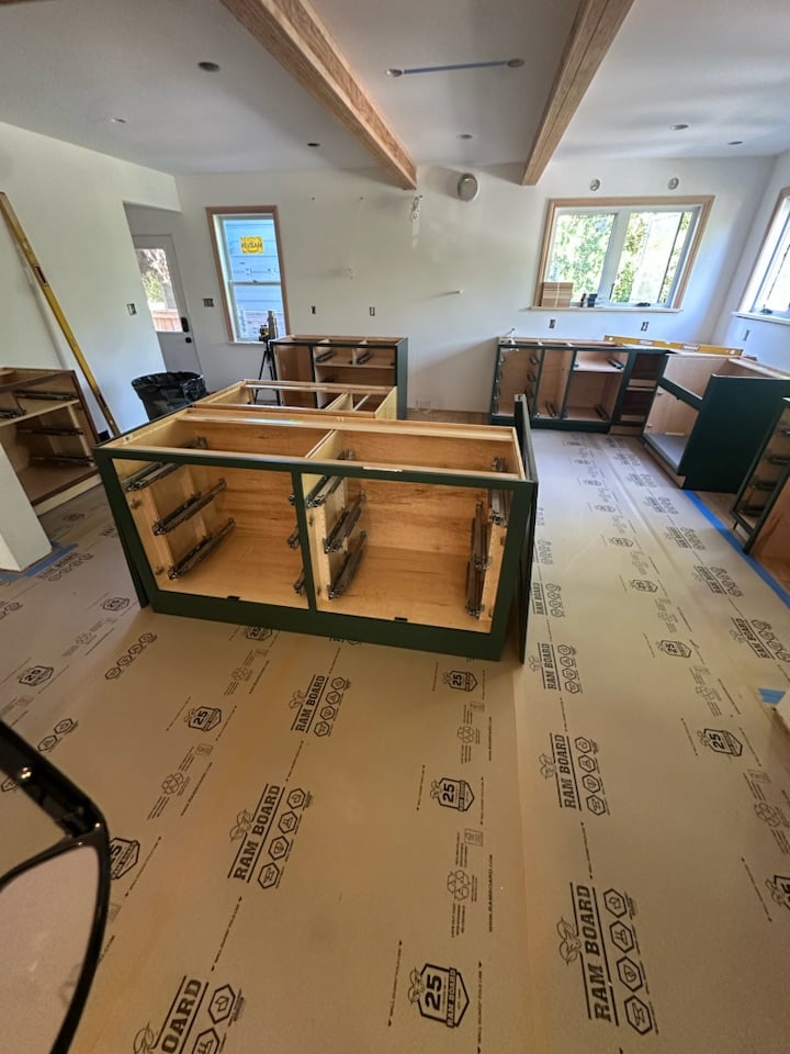
Our guiding idea was that the kitchen should take over the space the old dining room occupied and open directly to the living room. We removed the wall between the kitchen and the former dining room, which gave us a kitchen of about 257 square feet, more than double the original footprint. The most dramatic change was opening the wall between the kitchen and living room, giving this new space a great-room feel, where conversations and energy can flow easily between areas. Where that wall once stood, wood-wrapped beams now mark the transition into the living room. They define the zones while keeping sight lines open from the stove to the sofa.
A bedroom around the corner was re-purposed as the new formal dining room, about 160 square feet. It sits just off the kitchen, close enough to serve from easily and separate enough to feel like its own room. The existing load-bearing posts, beams, and footings stayed in place, with engineering review for any load transfer. The result is a dramatic change in how the house lives, achieved with minimal structural intervention.
BEFORE & AFTER
Design Choices That Make the Space
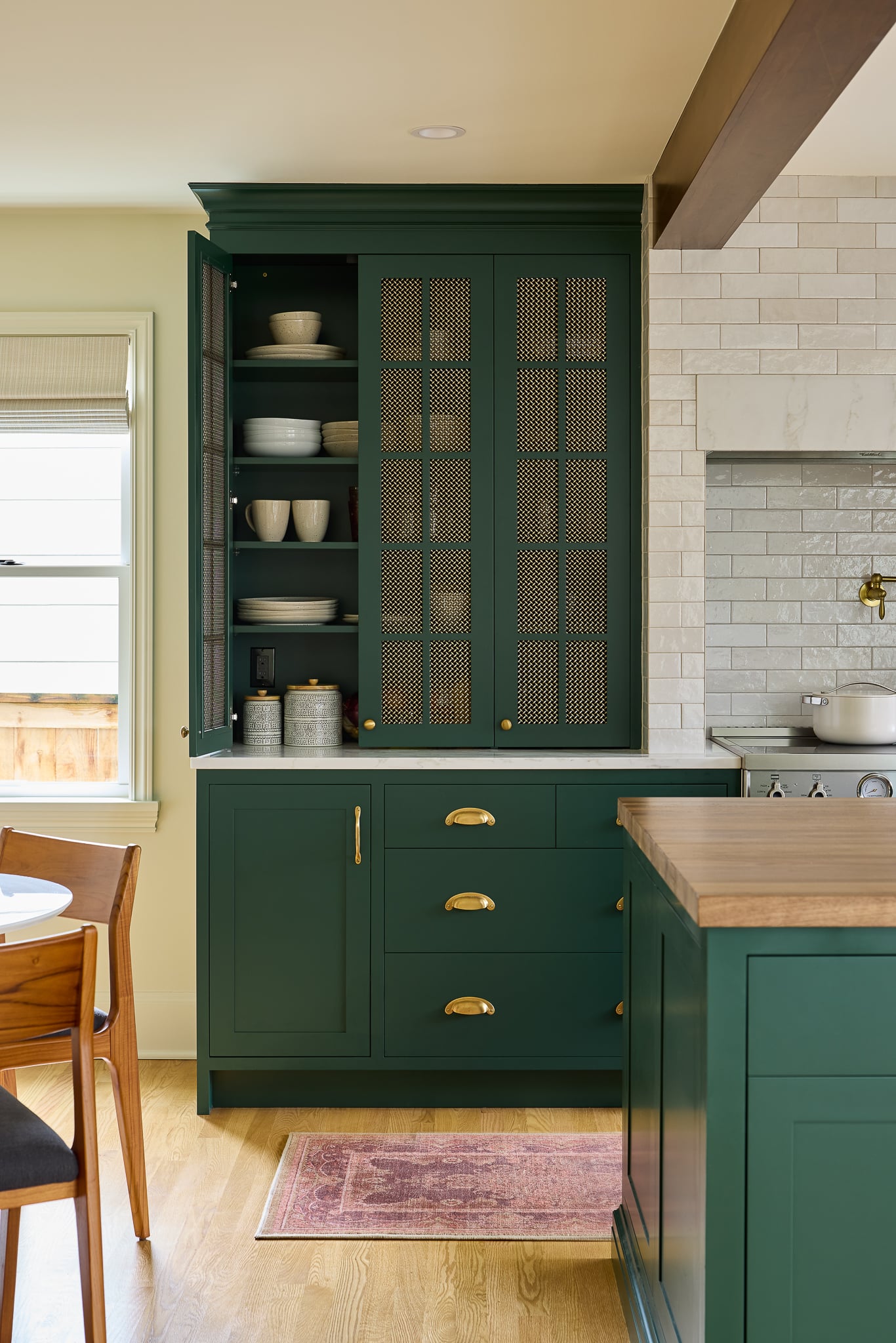
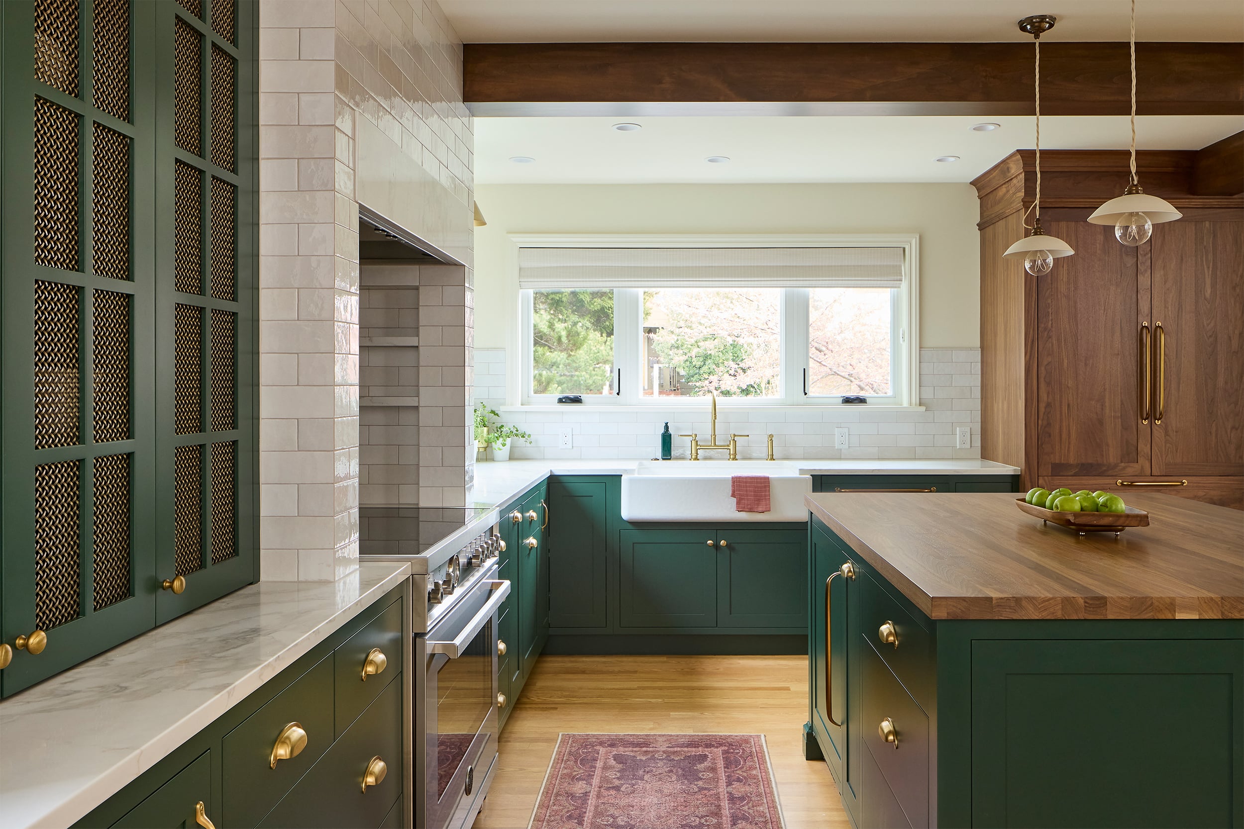
A two-tone palette with real character. The cabinetry is by Crystal Cabinets in a Keyline inset style with the Revere door, a clean, classic profile with a handcrafted feel. We used two finishes, a natural walnut with a flat sheen and a painted cabinet in Sherwin-Williams Dard Hunter Green in matte. The green is deep and inviting, and it grounds the room while the walnut adds warmth. The mix keeps the kitchen from feeling like a single block of cabinetry, and each finish gets a clear role in the layout.
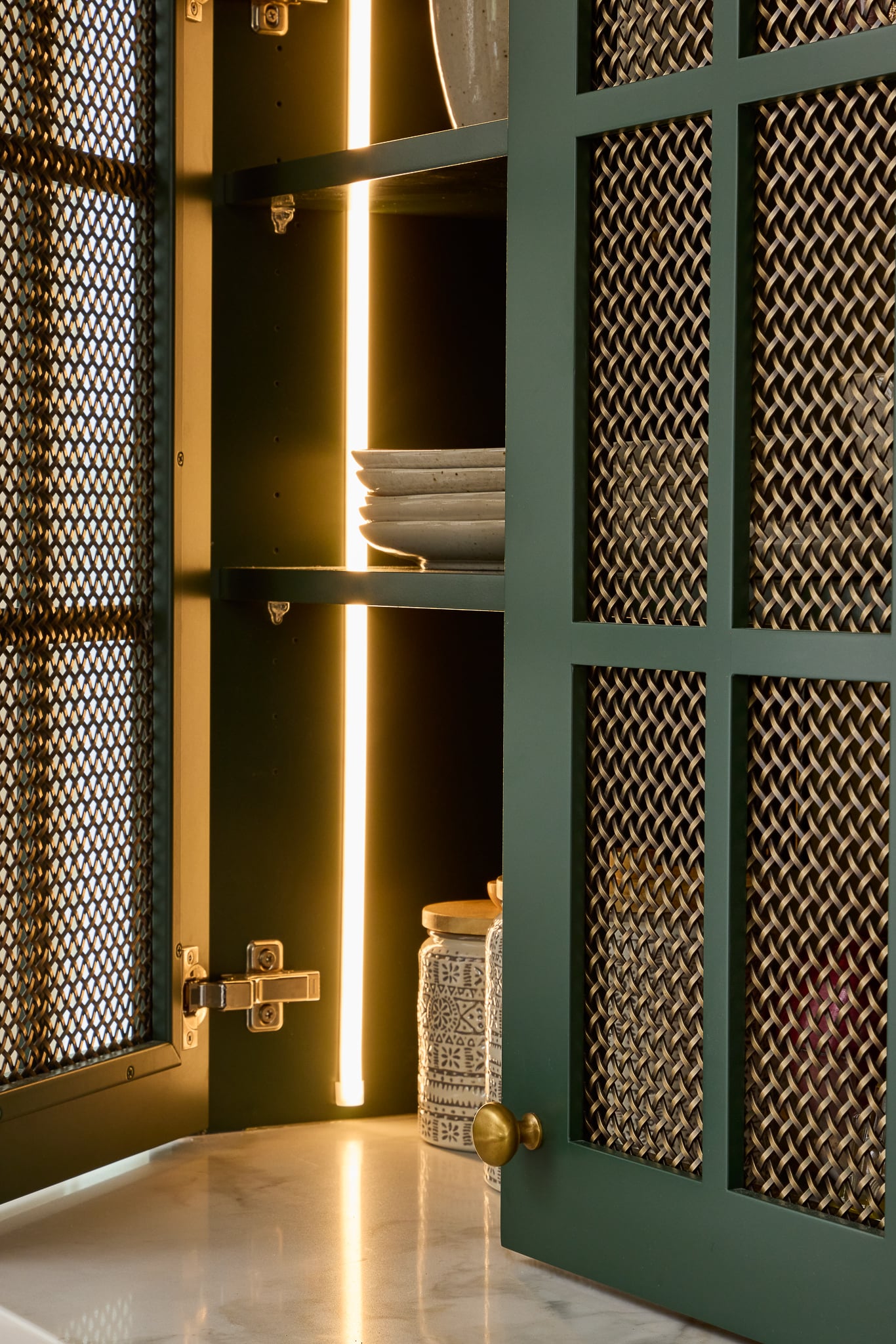
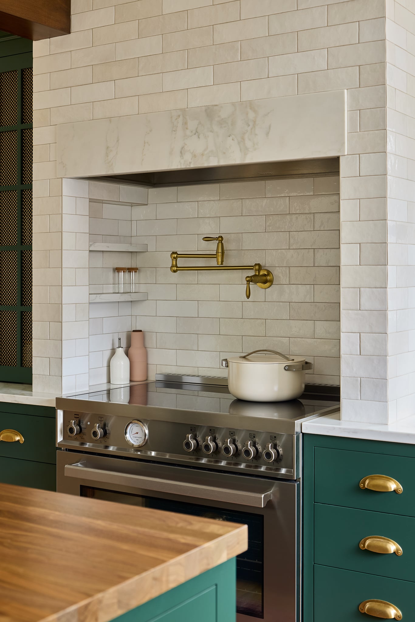
A statement range wall. Along the north wall, a 36-inch Bertazzoni induction range sits beneath a tile-wrapped hood surround with a stone lintel, finished with a Vent-A-Hood insert. Recessed spice niches flank the range, so everyday essentials stay within reach of the cook. To the left of the range, a painted hutch with banker-wire door panels in antique brass adds a touch of vintage elegance while providing generous, closed storage. Glossy white Bedrosians Cloé ceramic tile, laid in a classic subway-style format, runs up the wall and brightens the whole range zone.
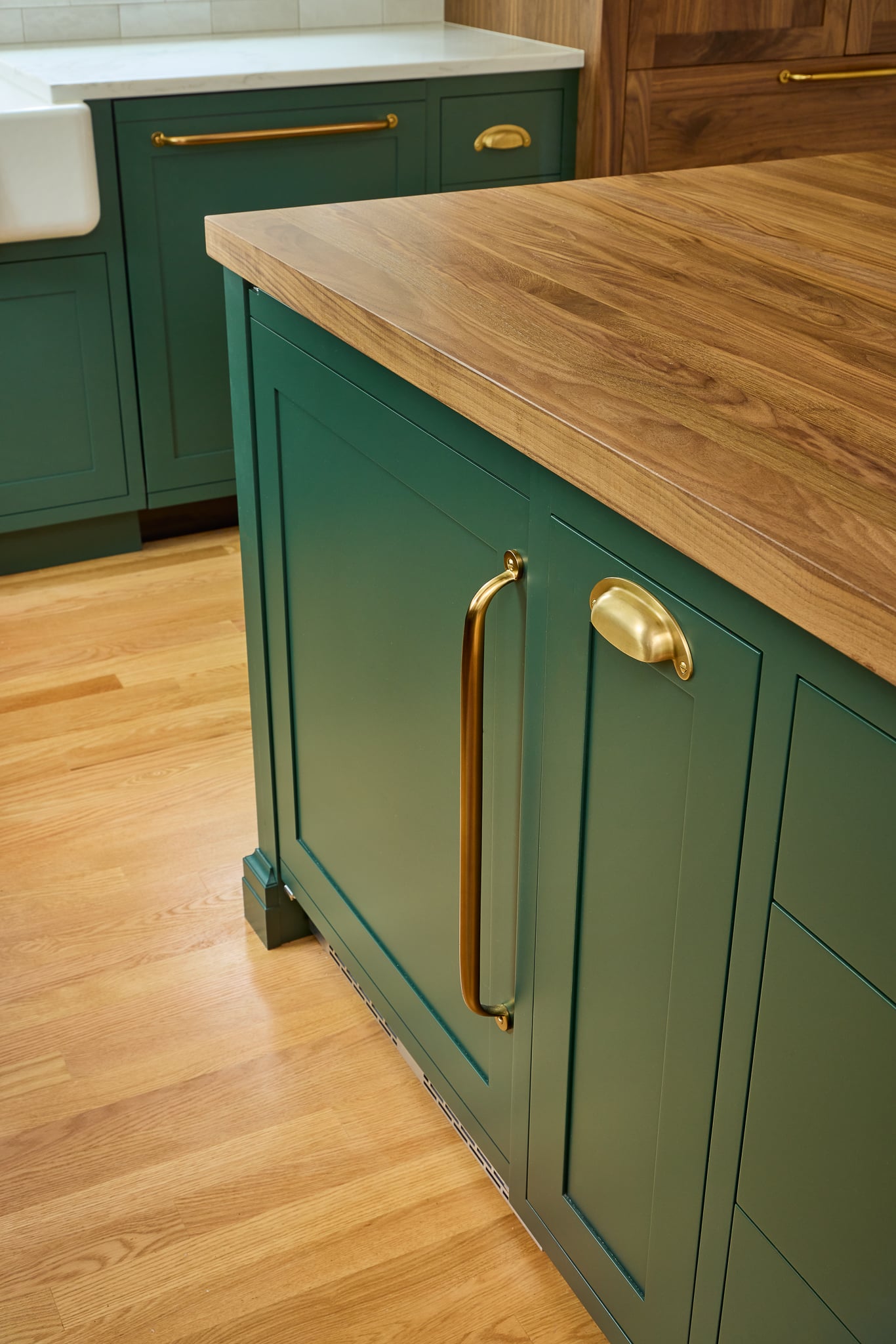
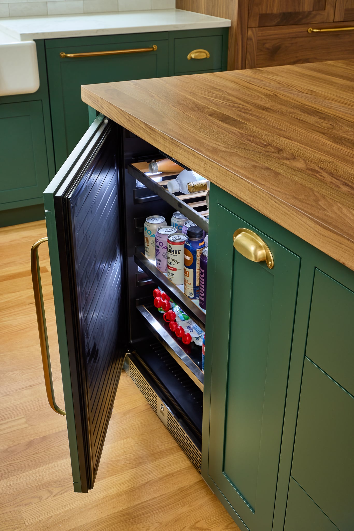
An island built for gathering. At the center of the room, a 66-inch island anchors the kitchen, featuring a stunning 1.5-inch thick walnut butcher block countertop. It is more than a work surface: it holds deep drawers, a stack of roll-outs, and a panel-covered beverage fridge, so drinks and snacks are within reach of guests. Mitered inset end panels on the island give it the look of a finished piece of furniture rather than a block of cabinets. Two porcelain skullcap pendants from deVol hang overhead and bring a soft, vintage note to the center of the room.
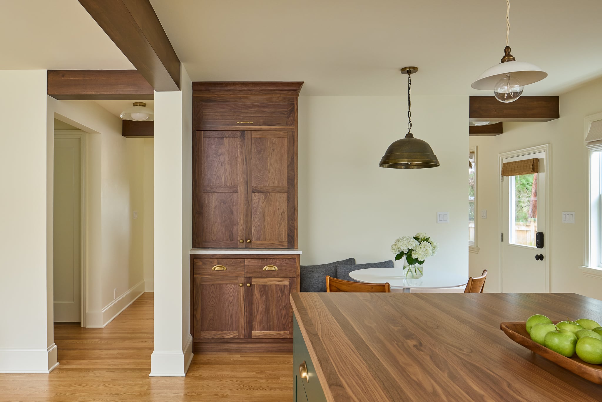
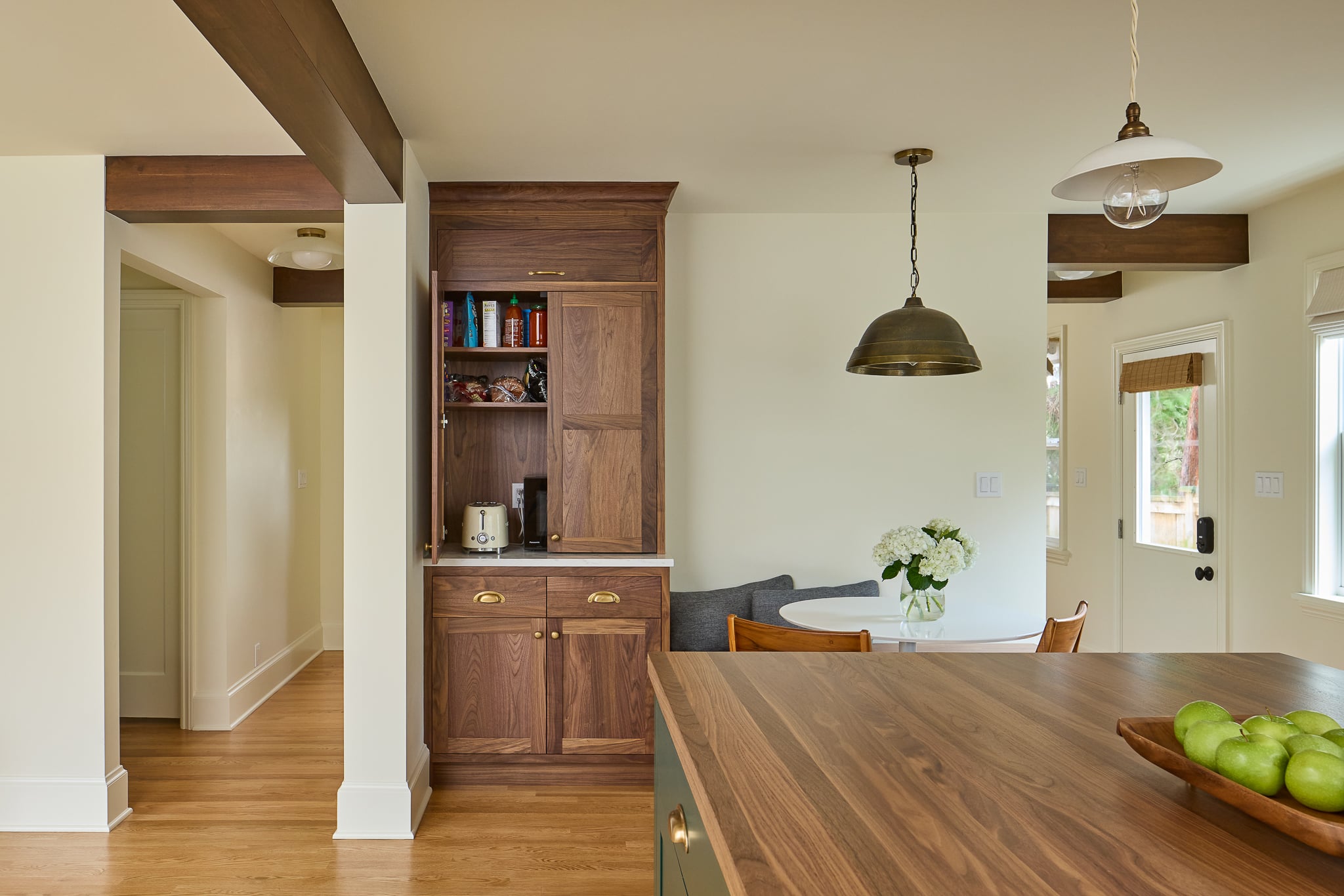
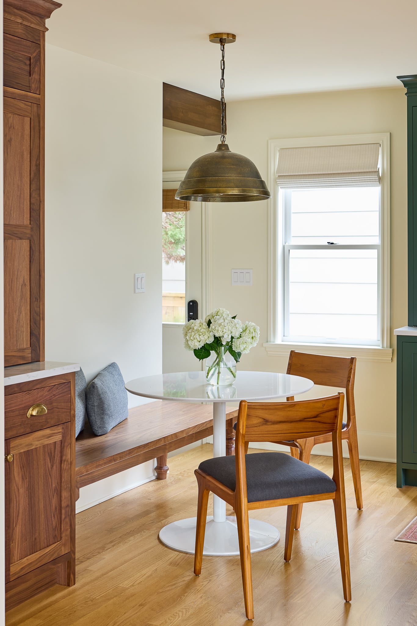
A bench for lingering. On the west side of the room, a custom built-in bench with black walnut legs and a walnut top anchors a small dining area. The seating area is paired with a dome pendant to create a casual spot for morning coffee, homework, or an extra seat when company comes. It is the kind of detail that makes a kitchen feel lived in.
Appliances that disappear. The Thermador French-door refrigerator and dishwasher, along with the beverage fridge, are all panel-ready. Matching walnut panels let them blend into the cabinetry, so the kitchen reads as furniture first and appliances second.
Windows with a view. We replaced three older windows with new Marvin Essential Series fiberglass units in Stone White, repositioned to suit the new layout. The window over the sink is offset to leave room for the optional floating glass shelves. A deep Kohler cast-iron farmhouse sink sits below it, paired with a brushed-gold Pfister faucet with side spray and a wall-mounted pot filler at the range.
Materials and Finishes
The material palette is rich but restrained, built around natural and long-lasting surfaces:
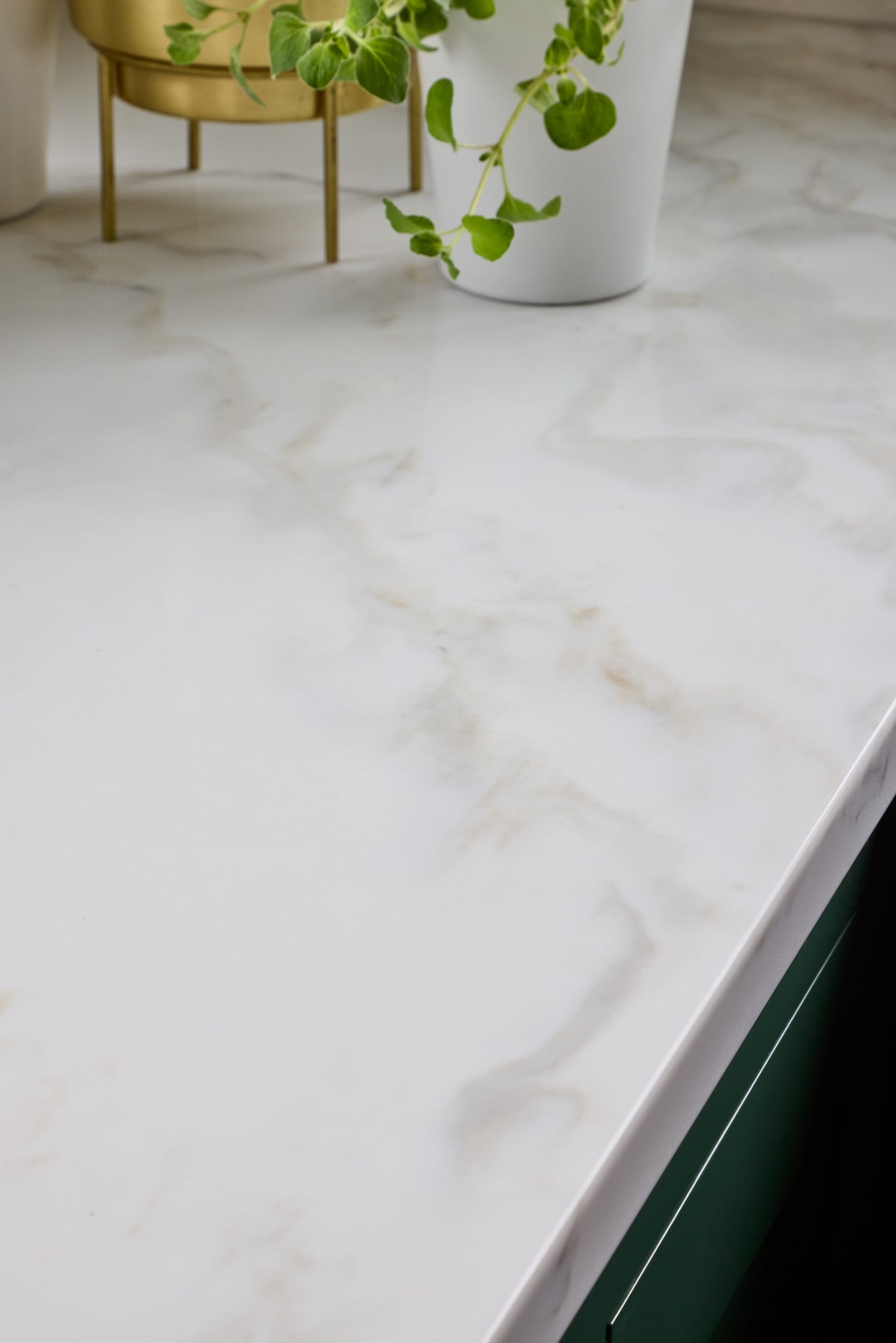
- Countertops: Regal Arabescato Gold from Stratus Surfaces, 3cm and polished. The soft veining in warm gray and gold ties together the brass hardware and the walnut.
- Wood accents: A John Boos–style edge-grain walnut top in a durable varnish finish, plus walnut beam wraps and trim details that carry the warm wood tone overhead.
- Flooring: Plainsawn white oak in 2¼-inch planks, sanded and finished on site with a Minwax Fruitwood stain in satin. The new floor was matched as closely as possible to the existing and feathered into it, so the kitchen feels like it has always been part of the house.
- Hardware: Satin aged brass cup pulls, bow handles, mushroom knobs, and cupboard latches, with heritage brass appliance pulls on the refrigerator and island. The warm metal ties into the faucet, the pot filler, and the lighting.
- Tile: White glossy ceramic with matching trim and a color-matched epoxy grout, giving a crisp, easy-to-clean backdrop.
Lighting was designed as carefully as the cabinetry. Brass sconces flank the kitchen window, pendants hang over the island and bench, and a linear chandelier in the dining room adds a graceful horizontal line. Milk-glass sconces in the dining room, flush mounts in the pass-through halls, and a double-drum chandelier in the family room carry the same warm, vintage character through the whole main floor. Everything is on dimmers, and LED strip lighting adds a soft glow where it is needed. The effect is a kitchen that works hard in the morning and settles into a warm, inviting glow by evening.
Green and Sustainable
Sustainability shaped this project from the start. The biggest green decision was reusing the home’s existing structure: the load-bearing posts, beams, and footings stayed, the existing disposal was re-installed, and the house gained no new footprint or impervious surface.
Within the kitchen, we selected sustainably sourced walnut, durable stone and ceramic, and a long-lasting solid-wood and brass palette that avoids frequent replacement. All lighting is high-CRI 2700K LED. Induction cooking, a 600 CFM exhaust with makeup air, and a 1.8 GPM faucet round out the efficiency and indoor air quality story. The new fiberglass windows meet a U-factor of 0.30 or better, and new framing cavities are insulated to current energy code, so the kitchen is both beautiful and comfortable year-round.
The Result
What was once a small, closed-off room is now a generous, welcoming space where cooking, dining, and conversation overlap. The kitchen has more than doubled in size and gained an island, a bench, abundant storage, and is now open to the living room. Rich materials and a carefully edited palette keep it warm and cohesive without losing the character of a 1942 home.